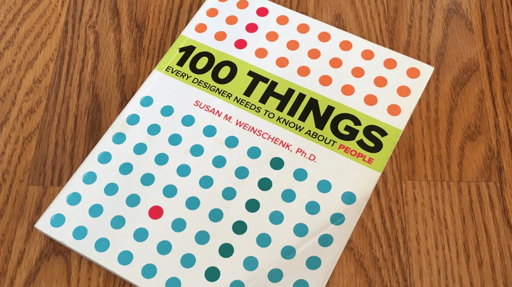

“100 Things Every Designer Needs to Know About People” by Susan Weinschenk, Ph.D., is an indispensable guide that bridges the gap between psychological research and practical design application. Weinschenk, a renowned behavioral psychologist, distills decades of scientific study into 100 actionable insights about how humans perceive, read, remember, think, focus attention, make decisions, are motivated, feel, and make mistakes. This book is crucial for anyone involved in design – be it web design, software development, product design, or marketing – because it provides a deep understanding of the user. By revealing the “why” behind human behavior, Weinschenk empowers designers to create more intuitive, engaging, and effective experiences. This summary promises to break down every important idea, example, and insight from the book in clear, accessible language, ensuring comprehensive coverage of its valuable lessons.
The Psychology of Design
This introductory section sets the stage by highlighting the paramount importance of understanding human psychology for any designer. Weinschenk emphasizes that regardless of what is being designed – from a website to a medical device – the audience is always people. Their total experience is profoundly impacted by the designer’s knowledge, or lack thereof, about human behavior. She poses fundamental questions: How do people think? How do they decide? What motivates them to click or purchase? The book’s core promise is to answer these questions, revealing insights into what grabs attention, common errors people make and why, and other critical aspects that lead to better design outcomes. Weinschenk explains that she has done the “heavy lifting,” synthesizing dozens of books and hundreds of research articles, combining this academic rigor with her extensive experience in designing technology interfaces. The result is a curated collection of 100 essential facts about people that every designer needs to know.
How People See
This chapter delves into the fascinating and often counter-intuitive ways our brains interpret visual information. It argues that what our eyes physically perceive is not directly what our brain “gets,” as the brain actively constructs and interprets visual input.
What You See Isn’t What Your Brain Gets
Our brain is a master of shortcuts and interpretation, constantly trying to make sense of the millions of sensory inputs it receives every second (an estimated 40 million). It uses rules of thumb, based on past experience, to make quick guesses about what we see. This process is so powerful that our brains will even create shapes out of empty space, as demonstrated by the Kanizsa triangle and rectangle illusions. These illusions reveal how our brains fill in gaps based on expectation, leading to errors but generally enabling rapid processing. Designers can leverage this by understanding how color and shapes influence perception, drawing attention to specific messages. Interestingly, the eye has many more rods (sensitive to low light) in peripheral vision than cones (sensitive to bright light) in central vision, meaning that for low-light situations, looking slightly off-center can improve visibility. Optical illusions serve as concrete examples of how the brain misinterprets visual input, such as the Müller-Lyer illusion where lines of the same length appear different due to arrowheads. The visual process starts with the eye sending 2D representations to the visual cortex, which then reconstructs these into 3D representations, integrating up to 12 tracks of information (shadows, movement, color, edges) into two main tracks: movement and location. This means designers should consider that user perception on a web page is influenced by background, knowledge, familiarity, and expectations, and that visuals can subtly persuade.
Peripheral Vision Is Used More Than Central Vision to Get the Gist of What You See
We possess both central vision for details and peripheral vision for broader awareness. Research from Kansas State University shows that peripheral vision is surprisingly critical for understanding the “gist” of a scene. In experiments where either the central or peripheral part of an image was obscured, participants could identify the scene (e.g., a kitchen vs. a living room) even when the central part was missing, but struggled when the periphery was obscured. This highlights why blinking or animated elements in the periphery are so annoying – they involuntarily grab our attention, disrupting focus on central tasks. This is exploited by advertisers. From an evolutionary perspective, keen peripheral vision was vital for survival, allowing early humans to detect threats like predators even when focused on other tasks. Studies by Dimitri Bayle demonstrated that the amygdala (the brain’s emotional center, highly responsive to fear) reacts significantly faster (80 milliseconds) to fearful objects in peripheral vision compared to central vision (140-190 milliseconds). Therefore, designers must ensure that information in the periphery clearly communicates the page’s purpose, and avoid distracting animations if central focus is desired.
People Identify Objects by Recognizing Patterns
Our brains are hard-wired to seek and create patterns, even in their absence. This ability helps us quickly make sense of sensory input. Simple groupings of dots, for example, are immediately perceived as patterns rather than individual elements. Early research by David Hubel and Torsten Wiesel demonstrated that specific cells in the visual cortex respond exclusively to horizontal, vertical, or angled lines, and edges. This foundational understanding informs the Geon Theory of object recognition, proposed by Irving Biederman in 1985. This theory suggests that instead of storing millions of exact object images, our brains recognize objects by breaking them down into 24 basic geometric icons (geons). When we see an object, our brain identifies these fundamental shapes, allowing for rapid recognition. Interestingly, the visual cortex is more active when imagining something than when actually perceiving it, implying it works harder to create the stimulus internally. Designers should leverage patterns (e.g., through grouping and white space), use simple geometric drawings for icons to aid quicker recognition of geons, and favor 2D elements over 3D as the eye processes 2D, and the brain then constructs 3D.
There’s a Special Part of the Brain Just for Recognizing Faces
Human brains possess a specialized area, the fusiform face area (FFA), dedicated solely to recognizing faces. Identified by Nancy Kanwisher in 1997, the FFA allows faces to bypass typical interpretive channels, enabling exceptionally fast and often emotional identification. This proximity to the amygdala (emotional center) explains the immediate emotional response associated with recognizing a familiar face. Research by Karen Pierce reveals that individuals with autism do not utilize the FFA for face recognition; instead, they use general visual cortex pathways typically used for objects, affecting their social interactions. Eye-tracking studies show that if a face in an image looks toward a product, users tend to follow that gaze, physically looking at the product. However, looking does not equate to paying attention, so designers must decide whether to use faces for emotional connection (direct gaze) or attention direction (gaze toward product). Newborns as young as an hour old demonstrate an innate preference for looking at facial features. Furthermore, studies by Christine Looser and T. Wheatley indicate that people primarily use the eyes to determine if a picture depicts a human and alive being, losing that perception around the 75% morph mark from human to mannequin. Designers should prioritize faces on web pages for their rapid recognition and emotional impact, use faces looking directly at users for emotional connection, and direct attention by having faces gaze towards desired elements.
People Imagine Objects Tilted and at a Slight Angle Above
When asked to draw common objects like a coffee cup, people consistently draw them from a specific perspective: tilted and viewed from a slight angle above. This phenomenon, dubbed the canonical perspective by Stephen Palmer in 1981, appears to be a universal trait, even for objects rarely seen from that angle (e.g., a small dog). This suggests that humans think about, remember, imagine, and recognize objects most quickly and effectively when presented from this preferred viewpoint. Designers should leverage this cognitive bias. To facilitate faster recognition and better recall of icons or objects, designers should draw them from a canonical perspective (slightly above, slightly offset). This aligns with the brain’s natural mental model for object representation, making the user experience more intuitive and efficient.
People Scan Screens Based on Past Experience and Expectations
When users encounter a new computer screen, their initial scanning patterns are heavily influenced by past experience and learned expectations. For cultures that read from left to right, scanning tends to follow that direction. However, users often skip the extreme edges of the screen, as they’ve learned these areas frequently contain less relevant information like logos, blank space, or navigation bars. Their “true top left” begins where meaningful content is expected. Once an initial glance is complete, scanning typically proceeds in the cultural reading pattern (left-to-right, top-to-bottom) unless a salient element like a large photo (especially a face) or animation pulls their attention elsewhere. Crucially, users also develop a mental model of where specific elements should be within particular applications or websites. For instance, frequent Amazon shoppers will instinctively look for the search field. If an unexpected problem or error occurs, users narrow their focus dramatically, concentrating almost exclusively on the problematic area, ignoring other parts of the screen. Designers should therefore place important information in the top third or middle of the screen, avoid critical content at the edges, and ensure screen layouts support natural reading patterns to prevent users from having to “bounce back and forth.”
People See Cues That Tell Them What to Do with an Object
In the real world, objects inherently communicate how they should be used through their design. This concept is known as affordance. A doorknob’s shape, for instance, affords grabbing and turning. If an object’s design cues conflict with its actual function (e.g., a door handle that looks like it should be pulled but must be pushed), it creates frustration, known as incorrect affordance. This idea was first articulated by James Gibson in 1979 as “action possibilities” in the environment, and later refined by Don Norman in 1988 to “perceived affordances” in his book The Design of Everyday Things. Designers need to ensure that objects, whether real or on a screen, clearly communicate their intended interactions. For computer screens, visual cues like shadows on buttons traditionally indicate that an element can be “pushed.” However, modern designs are increasingly abstracting these cues. For example, many hyperlinks are losing their traditional blue, underlined appearance, only revealing their clickable nature on hover – a cue that is lost entirely on touch devices like the iPad. Designers should purposefully use shading to indicate active or clickable states, avoid incorrect affordance cues, and rethink hover-dependent designs for touch interfaces.
People Can Miss Changes in Their Visual Fields
The phenomenon of inattention blindness or change blindness demonstrates that people often miss significant changes in their visual fields, even when those changes are plainly visible. The famous “Gorilla video” experiment, extensively researched by Christopher Chabris and Daniel Simons in The Invisible Gorilla (2010), perfectly illustrates this. Participants focused on counting basketball passes often fail to notice a person in a gorilla suit walking through the scene. Eye-tracking data from this experiment revealed that even when people’s eyes physically “saw” the gorilla (meaning their foveal gaze landed on it), only 50% were consciously aware of seeing it. This is because if attention is focused on one thing, and changes are not expected, they are easily missed. This insight also highlights a critical limitation of eye-tracking data: it shows where someone looked, but not necessarily what they paid attention to or perceived. Furthermore, as shown by Larson and Loschky’s research, peripheral vision is crucial, yet eye-tracking only measures central vision. Early work by Alfred Yarbus in 1967 also showed that eye-tracking data can be skewed by the questions asked of participants. Therefore, designers should never assume users will see a change just because it’s present, especially during screen refreshes. To ensure changes are noticed, additional visual cues (like blinking) or auditory cues (like a beep) are necessary. Designers should interpret eye-tracking data cautiously and not use it as the sole basis for design decisions.
People Believe That Things That Are Close Together Belong Together
A fundamental principle of visual perception, rooted in Gestalt psychology, is that proximity implies association. If two items are placed close to each other, especially horizontally (because of left-to-right reading patterns), people will automatically assume they are related. This cognitive shortcut is so strong that it can lead to confusion if elements intended to be separate are placed too close. For instance, if a photo is meant to accompany text below it, but is placed very close to text on its right, users may mistakenly link the photo to the adjacent text. Designers should actively use proximity as a powerful grouping mechanism. By minimizing space between related items (e.g., photos, headings, text blocks) and maximizing space between unrelated ones, visual noise is reduced, and clarity is enhanced. This simple application of white space can be more effective than using lines or boxes to delineate groupings, leading to a cleaner and more intuitive layout.
Red and Blue Together Are Hard on the Eyes
The combination of red and blue, when used for lines or text in close proximity, can create a visually jarring effect known as chromostereopsis. This occurs because the different wavelengths of light for red and blue are refracted differently by the lens of the eye, making one color appear to jump out or be closer, while the other seems recessed. This constant adjustment by the eye to focus on two seemingly different depths is straining and tiring for the eyes. While most pronounced with red and blue, this effect can also occur with red and green combinations. Designers should actively avoid placing red and blue (or red and green) elements directly adjacent to each other on a page or screen, particularly for text on a background of the other color. This prevents eye strain and improves readability, contributing to a more comfortable user experience.
Nine Percent of Men and One-Half Percent of Women Are Color-Blind
The term “color blindness” is often a misnomer; most affected individuals have a color deficiency, making it difficult to distinguish between certain colors, rather than being completely blind to all colors. This condition is primarily hereditary and linked to the X chromosome, explaining its higher prevalence in men (9%) compared to women (0.5%). The most common form is red-green color blindness, where distinguishing between reds, yellows, and greens is challenging. Rarer forms include blue-yellow deficiency or total gray vision. This poses a significant design challenge: if color is used as the sole indicator of meaning (e.g., red for danger, green for success), a substantial portion of the audience may miss critical information. The solution is redundant coding: using color in combination with another distinguishing feature, such as line thickness, patterns, or textual labels. Alternatively, designers can choose color schemes that are accessible to all, such as varying shades of brown and yellow, while avoiding problematic combinations like red, green, and blue. Tools like http://www.vischeck.com and colorfilter.wickline.org allow designers to simulate color deficiency effects on their designs. Interestingly, some color-blind individuals report being better at seeing camouflage, perhaps due to their reliance on patterns and textures rather than color.
The Meanings of Colors Vary by Culture
Colors carry powerful associations and meanings, but these are highly dependent on cultural context. A striking example is the color red: in Western financial contexts, “in the red” signifies losses or danger, while it can also mean “stop.” Green often symbolizes money or “go.” This variability becomes critical when designing for a global audience. For example, white signifies purity and is used for weddings in the U.S., but in many other cultures, it is the color of death and funerals. Similarly, the color associated with happiness can be white, green, yellow, or red depending on the region. While a few colors, like gold (representing success or high quality), have similar meanings globally, most do not. The David McCandless Color Wheel on InformationIsBeautiful.net is a valuable resource for cross-referencing color meanings across different cultures. While research shows that colors can affect mood, this effect primarily occurs when a person is surrounded by the color (e.g., in a painted room), not merely when viewing it on a computer screen. Therefore, designers must carefully select colors, considering their potential unintended associations within their target cultures.
How People Read
This section explores the intricate process of reading, debunking common myths and providing insights into how people truly engage with written text.
It’s a Myth That Capital Letters Are Inherently Hard to Read
The widespread belief that uppercase letters are inherently harder to read than mixed case or lowercase text, often attributed to the “word shape theory” (where unique word shapes aid recognition), is largely a myth. While it’s true that words in all caps appear as uniform rectangles, and mixed case offers more distinct shapes, modern research contradicts the idea that word shape is the primary mechanism for reading. Psycholinguists like Kenneth Paap (1984) and Keith Rayner (1998) have demonstrated that reading is primarily about recognizing and anticipating individual letters, and then, based on these letters, recognizing the word. Our eyes don’t move smoothly across a page; instead, they make rapid saccades (jumps of 7-9 letters) interspersed with fixations (short periods of stillness, ~250 milliseconds), during which we are effectively blind. We also use peripheral vision to read ahead, anticipating about 15 characters, though only understanding the meaning of the first 7. People do read uppercase text more slowly, but this is due to lack of practice/familiarity, as most text is mixed case, not due to an inherent difficulty. With practice, reading speed for all caps can match mixed case. However, in contemporary digital communication, all caps are perceived as “shouting,” making their widespread use undesirable for most content. Therefore, designers should use all uppercase sparingly, reserving it for headlines or urgent warnings where high attention is needed, rather than general body text.
Reading and Comprehending Are Two Different Things
The ability to read words does not automatically equate to comprehension. Understanding new information relies heavily on plugging it into existing cognitive structures, or schemata. A paragraph of technical jargon, while readable, may be incomprehensible to someone without the relevant background knowledge. The Flesch-Kincaid Readability Formula is a common tool to quantitatively assess text readability, providing both a “reading ease” score and a “reading grade-level” score (higher scores indicate easier reading). This highlights that designers should tailor the reading level of their text to their specific audience, using simpler words and fewer syllables for broader accessibility. Our reading process is highly anticipatory, with prior knowledge making it easier to predict and interpret upcoming words. Titles and headlines are exceptionally critical because they provide a contextual framework that dramatically aids comprehension. Even poorly written text becomes more understandable with a clear, relevant title. Furthermore, brain imaging shows that different parts of the brain are activated depending on how words are processed – viewing, listening, speaking, or generating verbs each engage distinct neural regions. Finally, what information is remembered from reading is profoundly influenced by the reader’s point of view and prior instructions, demonstrating that people are active constructors of meaning, not passive absorbers. Designers should never assume specific information will be remembered and must always provide meaningful titles and accessible reading levels.
Pattern Recognition Helps People Identify Letters in Different Fonts
The centuries-old debate over whether serif or sans-serif fonts are easier to read is largely moot; research consistently shows no significant difference in comprehension, reading speed, or user preference between them. The true mechanism for letter identification lies in pattern recognition. Our brains don’t store every variation of a letter (e.g., all the different “A”s); instead, they form a memory pattern of what an “A” generally looks like, and then recognize variations that fit this pattern. This means font choice for readability is less about serifs and more about avoiding excessive decorativeness that interferes with the brain’s ability to recognize these underlying patterns. Highly decorative or unusual fonts force the brain to work harder, slowing down reading. This difficulty in processing the font can even transfer to the perception of the content itself. Hyunjin Song and Norbert Schwarz (2008) found that instructions presented in a hard-to-read font (e.g., Brush Script) led people to estimate the task would take twice as long and be more difficult, making them less willing to attempt it, compared to the same instructions in an easy-to-read font (e.g., Arial). Designers should prioritize legibility over ornamentation, choosing fonts that allow for quick and effortless pattern recognition to avoid negatively impacting the perceived difficulty or trustworthiness of the content.
Font Size Matters
Beyond font style, size is a critical factor for readability, directly impacting user comfort and minimizing strain. This applies not only to older users, but also to younger individuals who equally complain about small text. A key concept here is x-height, which refers to the actual height of the lowercase “x” in a given typeface. Different fonts, even at the same point size, can appear larger or smaller due to their varying x-heights. Fonts like Tahoma and Verdana were specifically designed with larger x-heights to enhance readability on screens. Therefore, when selecting fonts for digital interfaces, designers should choose a point size large enough for comfortable reading across various age groups and opt for fonts with a large x-height to make the type appear more substantial and easier to decipher, thereby reducing eye fatigue.
Reading a Computer Screen Is Harder Than Reading Paper
The fundamental difference in reading experience between a computer screen and paper stems from their distinct mechanisms. A computer screen constantly refreshes and emits light, which is tiring for the eyes. In contrast, paper provides a stable image and reflects light, mimicking natural reading conditions. Technologies like e-ink displays (e.g., Kindle) aim to replicate the paper experience by reflecting light and holding text stable without refreshing. To mitigate eye strain and improve readability on computer screens, designers should prioritize large font sizes and ensure ample contrast between foreground and background. The optimal and most readable combination is black text on a white background. Additionally, breaking text into smaller, bite-sized chunks using bullets, short paragraphs, and images significantly aids comprehension and engagement, making the digital reading experience less arduous and more accessible. Ultimately, however, the most crucial factor remains the relevance and interest of the content itself to the audience.
People Read Faster with a Longer Line Length, But They Prefer a Shorter Line Length
Designers often face a dilemma when determining column width: should lines be long (e.g., 100 characters) or short (e.g., 50 characters)? Research by Mary Dyson (2004) reveals a paradox: people read faster with longer line lengths (around 100 characters per line), but they prefer shorter or medium line lengths (45 to 72 characters per line). This is because longer lines interrupt the natural flow of saccades and fixations less frequently. Every time the eye reaches the end of a line, a saccade-fixation interruption occurs; shorter lines create more such interruptions, slowing down overall reading speed. Similarly, people can read a single wide column faster than multiple columns, but they prefer multiple columns. This preference persists even when users are asked which layout they read faster, demonstrating a disconnect between perceived and actual efficiency. Designers must weigh their priorities: if reading speed is paramount, a longer single-column layout is optimal. If user preference and perceived ease are more critical, then shorter line lengths and multiple columns are preferred. For multi-page articles, designers might consider a shorter line length with multiple columns to enhance the user’s perception of ease.
How People Remember
This chapter delves into the complexities and limitations of human memory, offering crucial insights for designers aiming to create intuitive and memorable user experiences.
Short-Term Memory Is Limited
Our working memory, often referred to as short-term memory, is highly limited and easily disrupted. It holds information for only a brief period (less than a minute) and is directly tied to our ability to focus attention. If attention wavers or is interfered with by competing stimuli, the information is quickly lost. This explains the frustration of trying to remember a phone number while someone is talking. Brain imaging studies (fMRI) show that the prefrontal cortex (PFC), responsible for focused attention, lights up during working memory tasks. Its connections to other brain areas, like the left hemisphere for words/numbers or the right hemisphere for spatial relations, increase when working memory is active. The PFC’s role in choosing strategies and directing attention profoundly impacts what is retained. Interestingly, there’s an inverse relationship between working memory capacity and sensory input processing: individuals with high-functioning working memories are better at screening out environmental distractions. Furthermore, stress significantly impairs working memory due to reduced activity in the prefrontal cortex. Research by Tracy Alloway (2010) even links working memory capacity in five-year-olds to later academic success. For designers, this means avoiding tasks that require users to remember information from one location to another (e.g., copying numbers). If information must be held in working memory, minimize all other sensory input and distractions during that critical task to prevent interference and frustration.
People Remember Only Four Items at Once
A pervasive “urban legend” in psychology is George A. Miller’s (1956) “magical number seven, plus or minus two,” suggesting humans can process 5-9 items at a time. However, subsequent research, notably by Alan Baddeley (1986, 1994) and Nelson Cowan (2001), has largely debunked this for working memory capacity, concluding that the true “magical number” is closer to four. People can reliably hold three or four items in working memory, provided there are no distractions or interferences. This limitation applies not just to active working memory but also to long-term memory retrieval, as shown by George Mandler (1969). He found that recall accuracy plummeted when categories contained more than three items, falling from perfect recall (1-3 items) to 80% (4-6 items), and significantly lower for larger categories. Even chimpanzees demonstrate a similar four-item memory limit, as shown in studies by Nobuyuki Kawai and Tetsuro Matsuzawa (2000). To overcome this limitation, humans employ “chunking,” grouping information into smaller, more manageable units (e.g., phone numbers are chunked into three segments). Designers should strive to limit information to four items per “chunk” or screen view. While not always feasible, breaking down larger sets of information into logical, four-item groupings (e.g., in menus or lists) can significantly enhance memorability and usability. It’s also important to acknowledge that users often rely on external memory aids (notes, calendars) rather than internal recall.
People Have to Use Information to Make It Stick
Information can be transferred from working memory to long-term memory primarily through two mechanisms: repetition or connection to existing knowledge. Repetition physically alters the brain: repeated activation of neurons strengthens their connections, eventually forming a “firing trace” where initiating a sequence triggers the recall of the entire memory. This explains why rote memorization works and why “practice makes perfect.” Beyond repetition, connecting new information to existing cognitive structures, or schemata, is highly effective. A schema is an organized pattern of thought or behavior that helps categorize and interpret information, like having a “head” schema that encompasses brain, eyes, nose, etc. When new data can be “plugged into” an existing schema, it’s easier to store and retrieve. Experts in any field possess highly organized and powerful schemata, allowing them to process and recall vast amounts of information as single, complex “chunks.” For instance, an expert chess player can instantly recall a game’s setup and strategies, while a novice needs many smaller schemata. Designers should leverage this by identifying and understanding the existing schemata of their target audience through user research. When introducing new information, explicitly point out connections to users’ existing schemata to facilitate learning and retention. If information is critical, repetition and consistent exposure should be incorporated into the design.
It’s Easier to Recognize Information Than Recall It
When it comes to retrieving information from memory, recognition is significantly easier than recall. In a recall task, you must retrieve information purely from memory (e.g., writing down a list of words from scratch). In a recognition task, you are presented with information and simply need to identify if you’ve seen it before (e.g., choosing words from a list or identifying objects in a room). Recognition is facilitated by contextual cues, which help trigger memory. This principle is why multiple-choice tests are often easier than essay questions. A common error during recall is inclusion errors, where people add items that were not originally present but fit an activated schema (e.g., remembering “desk” or “pencil” from an “office” list, even if not present). Interestingly, children under five make fewer inclusion errors because their schemata are not yet as fully formed as adults’. For designers, the key takeaway is to minimize memory load whenever possible. Prioritize recognition over recall in interfaces; instead of asking users to remember and type in information, provide options for them to recognize and select. This aligns with fundamental usability guidelines and reduces user frustration.
Memory Takes a Lot of Mental Resources
Despite the brain’s vast capacity (23 billion neurons), conscious memory and information processing require substantial mental resources. While the brain processes billions of sensory inputs unconsciously, only a small fraction (around 40) reach conscious awareness. Actively thinking about, remembering, processing, representing, and encoding information is cognitively “expensive.” Memory is also easily disrupted. The recency effect dictates that people are most likely to remember information presented at the end of a session (e.g., a presentation). Conversely, the suffix effect shows that an interruption (like a phone vibrating during a presentation) can cause people to remember the beginning but forget the ending. Interesting facts about memory include the easier storage of concrete words (table) over abstract words (justice), mood-congruent recall (sadness prompts sad memories), and infantile amnesia (inability to remember before age three). Visual memory is generally stronger than verbal memory. Research by Matthew Wilson (2007) on rats suggests that sleep and dreaming are crucial for memory consolidation, as the brain actively reworks experiences and forms new associations, deciding what to retain and forget. Rhymes aid memory through phonological coding, where the sound patterns make sequences easier to retrieve, a technique used in oral traditions before written language. Designers should use concrete terms and icons for better recall, allow users to rest or sleep for information retention, and avoid interruptions when users are learning or encoding critical information.
People Reconstruct Memories Each Time They Remember Them
Contrary to the common belief that memories are stored perfectly like archived movie clips, they are in fact reconstructed anew each time they are accessed. Memories are not fixed files but rather nerve pathways that re-fire, making them susceptible to change. This reconstruction process can be influenced by subsequent events, subtly altering the memory of the original event. For example, a later argument with a cousin might subconsciously alter the memory of a previously positive interaction, making the cousin seem aloof in the recalled memory. Moreover, people often fill in memory gaps with fabricated details that feel as real as original events, such as remembering a person at a dinner who was not actually there, simply because they typically attend. This reconstructive nature is a key reason why eyewitness testimonies are notoriously unreliable. Elizabeth Loftus’s (1974) research demonstrated that the wording of questions (e.g., “hit” vs. “smashed” in a car accident scenario) could significantly alter perceived speeds and even implant false memories of details like broken glass. Witnesses told to close their eyes while recalling events tend to have clearer and more accurate memories (Perfect, 2008). Emerging research by Johns Hopkins scientists (2010) even suggests the possibility of erasing specific memories. For designers and researchers, this means exercising caution when interpreting self-reports of past behavior or experiences. The language used in interviews or surveys can inadvertently shape what people “remember,” making such data unreliable. Designers should take “after the fact” accounts with a grain of salt.
It’s a Good Thing That People Forget
While forgetting often seems like a flaw, it’s actually a crucial and adaptive human mechanism. Given the immense volume of sensory inputs and experiences we encounter every second, day, and lifetime, remembering absolutely everything would lead to a state of cognitive overload and functional paralysis. Our brains are constantly, and largely unconsciously, deciding what information to retain and what to discard. This selective forgetting is essential for healthy cognitive function and survival. Hermann Ebbinghaus’s (1886) “Forgetting Curve” mathematically illustrated this degradation of memories: R = e(−t/S), where R is retention, S is memory strength, and t is time. The curve shows that information is forgotten rapidly unless it is actively moved into long-term memory. Flashbulb memories, despite their vividness, are also subject to this forgetting curve, highlighting that intensity of experience doesn’t guarantee accuracy or permanence. Designers should inherently design with forgetting in mind. Crucial information should not rely solely on user recall; instead, it should be provided within the design itself (e.g., clear labels, contextual help) or offer easy lookup mechanisms. Since forgetting is an unconscious and unavoidable process, robust design should compensate for it rather than expect perfect user memory.
The Most Vivid Memories Are Wrong
While “flashbulb memories” – the highly detailed and vivid recollections of traumatic or dramatic public events (like 9/11 or the Challenger disaster) – feel incredibly real and accurate due to the amygdala’s (emotion center) proximity to the hippocampus (memory coding), research consistently shows they are often full of errors. Ulric Neisser’s (1992) study on the Challenger explosion memories revealed that over 90% of his students’ accounts differed significantly three years later, with half being inaccurate in two-thirds of the details. Despite the strong emotional imprint, these memories degrade over time just like others, a fact people find disturbing because the vividness implies truth. This leads to a critical paradox: the more vivid a memory feels, the more convinced a person is of its accuracy, even when it’s largely incorrect. For designers, this is a vital cautionary insight. If users recount dramatic or traumatic experiences with your product or service, understand that while their emotional conviction is real, their recollection of specific details may be highly inaccurate. Therefore, do not rely solely on self-reported vivid memories for factual information during user research or feedback sessions. Acknowledge their emotional truth, but seek corroborating data for factual accuracy.
How People Think
This chapter explores the fascinating and often counterintuitive ways the human brain processes information, makes connections, and forms understanding, revealing “thinking illusions” similar to visual ones.
People Process Information Better in Bite-Sized Chunks
The human brain has a limited capacity for conscious information processing, estimated at only 40 pieces of information per second out of billions of sensory inputs. This highlights a common design mistake: overwhelming users with too much information at once. The solution is progressive disclosure, a technique that provides only the information people need at a given moment, revealing more details incrementally. For instance, a service like MailChimp effectively uses this by presenting a high-level overview, then revealing more details upon a click, and allowing users to drill down further for even more information. This approach prevents cognitive overload and caters to different user needs – some may only need an overview, others want full detail. Crucially, progressive disclosure often requires multiple clicks, which challenges the outdated notion that minimizing clicks is always paramount. In reality, the number of clicks is not important if each click provides the right amount of relevant information that keeps the user moving forward purposefully. As Steve Krug famously articulated in Don’t Make Me Think, “if you have to make a trade-off on clicks versus thinking, use more clicks and less thinking.” However, successful progressive disclosure relies on thorough user research to understand what information users want and when they want it; without this, it can lead to frustrating searches. The concept originated with J.M. Keller’s ARCS instructional design model, emphasizing presenting only what the learner needs at that moment.
Some Types of Mental Processing Are More Challenging Than Others
In human factors, the demands placed on a person are categorized as loads: cognitive (thinking, memory, calculation), visual (looking, finding), and motor (physical actions like clicking or typing). These loads are not equal in terms of the mental resources they consume. Cognitive load is the most “expensive,” followed by visual load, and then motor load being the least demanding. This hierarchy provides a crucial framework for design trade-offs. For example, adding a few clicks (increasing motor load) is often preferable if it significantly reduces the need for users to think or remember (decreasing cognitive load). This explains why a complex task requiring many clicks can still be perceived as “easy” if each step is logical and requires minimal thinking. Fitt’s Law is a mathematical model used to quantify motor load, linking the time to move a pointer to a target’s distance and size; it implies that larger, closer targets are easier to hit reliably. Designers should also minimize motor switching (e.g., between keyboard and mouse) for heads-down data entry tasks. While the goal is usually to reduce loads for ease of use, designers might intentionally increase loads in specific contexts, such as in gaming, where increased cognitive, visual, or motor challenges are part of the intended engaging experience. Therefore, evaluating and strategically adjusting these loads is fundamental to effective product design.
Minds Wander 30 Percent of the Time
Mind wandering refers to the common phenomenon of a person’s attention drifting from the task at hand to unrelated thoughts. It differs from daydreaming, which encompasses any stray thoughts or fantasies. Studies by Jonathan Schooler indicate that people underestimate mind wandering, believing it occurs about 10% of the time, when it actually happens up to 30% during daily activities, and as high as 70% in less stimulating environments like driving on an uncrowded highway. Neuroscientists initially found mind wandering annoying during brain scan research, as it produced extraneous results, but later began studying it as a legitimate cognitive state. While a wandering mind can be detrimental if it causes users to miss important information (akin to “zoning out”), it can also be beneficial. It allows one part of the brain to focus on a task while another keeps a higher goal in mind, facilitating mental “switching” that some consider the closest thing to multitasking. Research by Christoff (2009) suggests that frequent mind wanderers tend to be more creative and better problem solvers, as their brains simultaneously process information and make novel connections. Designers should assume users’ minds will wander frequently. This implies building in clear feedback mechanisms to help users reorient themselves if they drift. Hyperlinks and easy navigation can support this natural human tendency to “surf” between topics, as long as the user can easily return to their primary task.
The More Uncertain People Are, The More They Defend Their Ideas
People exhibit a strong psychological defense mechanism when faced with cognitive dissonance, the uncomfortable feeling arising from holding two conflicting ideas or beliefs. As described by Leon Festinger (1956), individuals attempt to resolve this discomfort either by changing their belief or by denying the conflicting information. In initial cognitive dissonance research, people who were forced to publicly defend an opinion they didn’t believe often subsequently changed their actual belief to reduce dissonance, as shown by Vincent Van Veen’s (2009) fMRI studies where brain regions associated with conflict resolution activated. However, when people are not forced to change their belief but are merely presented with opposing information, they often dig in and defend their existing ideas more vehemently. David Gal and Derek Rucker (2010) demonstrated that uncertainty exacerbates this defensive posture: when made to feel uncertain about their choices (e.g., dietary preferences or Mac vs. PC), participants would construct more numerous and stronger arguments to persuade others, even though they were less confident themselves. This implies that directly challenging someone’s deeply held beliefs with logical evidence can backfire, causing them to entrench further. Designers should avoid attempting to directly change ingrained beliefs and instead focus on encouraging small, initial commitments that can gradually shift self-perception and loyalty over time.
People Create Mental Models
A mental model is an internal representation a person has of how something works, based on incomplete facts, past experiences, and intuitive perceptions. These models shape actions, influence attention, and guide problem-solving. For instance, a user’s first interaction with an iPad for reading books is guided by their existing mental model of what “reading an e-book” entails, potentially influenced by prior Kindle use or even physical books. This concept, first discussed by Kenneth Craik in 1943 and revived in the 1980s by Philip Johnson-Laird and Dedre Gentner, is fundamental to design. In the design field, a mental model is the user’s understanding of a system (real world, device, software). Users form these models quickly, even before direct interaction, drawing from prior experience with similar products, assumptions, and hearsay. Mental models are dynamic and adjust with experience. Understanding the mental models of a target audience through user research (e.g., task analysis, observations, interviews) is crucial for creating intuitive designs. This means recognizing that not everyone has the same mental model, and assuming uniformity can lead to unusable products. Designers must actively work to understand these internal frameworks to ensure their designs align with user expectations.
People Interact with Conceptual Models
Complementing mental models, a conceptual model is the actual design and interface of a product, representing how the system actually works as presented to the user. The success of a product’s usability and acceptance hinges on the alignment between the user’s mental model and the product’s conceptual model. A mismatch occurs when the designer’s implicit model (how they think it should work) doesn’t align with the user’s expectations. This can happen if designers make incorrect assumptions about their audience’s experience, design for a narrow persona that excludes other user groups, or if the conceptual model simply reflects the underlying technology (e.g., database structure) rather than user needs. In such cases, the product becomes difficult to learn, hard to use, or is rejected. When designing entirely new products that inherently won’t match existing mental models (like the first iPad for someone only familiar with physical books), the goal shifts from matching to changing the user’s mental model. This is achieved through effective training, such as short instructional videos, which prepare users for the new conceptual model. The user-centered design (UCD) process is fundamentally about understanding users’ mental models and designing conceptual models to fit them, or providing the necessary education when a new model is introduced. Therefore, designers must purposefully design the conceptual model to match user expectations, or strategically provide training to bridge the gap for novel interactions.
People Process Information Best in Story Form
Stories are an incredibly powerful tool for capturing and holding attention, aiding information processing, and implying causation. The author’s personal anecdote of engaging a disengaged audience by starting with “Let me tell you a story” vividly illustrates this. This technique is effective because stories naturally align with how the human brain processes information. Aristotle’s basic three-act structure (beginning, middle, end) is a tried-and-true format, introducing characters and conflict, presenting obstacles, and resolving the climax. Common narrative themes like “The Great Journey” or “Love” reappear across cultures and media due to their inherent appeal. Crucially, stories imply causation even when none explicitly exists. By presenting events in a chronological narrative, the brain automatically connects them as cause-and-effect, often leading to false inferences. For instance, connecting “Joey’s big brother punched him” with “The next day his body was covered by bruises” creates a clear causal link, but connecting “Joey’s crazy mother became furiously angry” with “The next day his body was covered by bruises” also implies causation, even if not explicitly stated. This highlights our brain’s constant search for causality, filling in gaps to create a coherent narrative. Stories are not just for entertainment; they are essential for all forms of communication, even for seemingly dry financial information. Medtronic’s annual report, for example, weaves patient stories and high-quality photos among financial data to make it more engaging and connect the numbers to the company’s mission. Designers should leverage stories as a natural way to communicate, making information understandable, interesting, and memorable, and using them to subtly guide users toward desired causal inferences.
People Learn Best From Examples
When teaching or explaining complex information, examples are far more effective than mere instructions. This principle is powerfully demonstrated by the contrast between a long, text-only set of instructions (like MailChimp’s email campaign setup) and the same instructions supplemented with visual examples (e.g., screenshots or videos). The author illustrates this by showing MailChimp’s actual approach, which combines step-by-step text with relevant screen captures, making the process significantly easier to understand and follow. Video is presented as one of the most effective online examples, as it combines movement, sound, and vision, engaging multiple senses and reducing reliance on reading alone. This multi-modal approach enhances attention and comprehension. Therefore, designers should avoid simply telling users what to do. Instead, they should prioritize showing through concrete examples, utilizing screenshots and pictures for visual demonstrations, and, even more effectively, incorporating short, focused videos to illustrate processes. This approach caters to how people naturally learn and makes complex tasks much more accessible and less intimidating.
People Are Driven to Create Categories
Humans have an innate, powerful drive to categorize the world around them. This fundamental cognitive process is as natural as learning a native language. While young children (before age seven) may not fully grasp abstract categorization, they quickly become fascinated with organizing information as they age. This inherent drive is readily observable in user research techniques like card sorting, where participants enthusiastically group information into categories that make sense to them. This enthusiasm underscores that people use categorization as a primary method for making sense of overwhelming amounts of information. If designers do not provide clear categories, users will attempt to impose their own organizational structures, which may or may not align with the system’s logic, leading to confusion. Research also indicates that while users may have preferences for how information is organized, the most crucial factor for recall is that the information is well-organized, regardless of whether the user or the designer created the scheme. Therefore, designers should always organize information for their audience, keeping in mind the “four-item rule” for memory (no more than four items per chunk). Gathering user input on preferred organization schemes is valuable, but the core imperative is to provide a clear and logical structure. When designing for children under seven, remember that imposed categories are likely more for the adults supporting the child than for the child’s own cognitive processing.
Time Is Relative
Our experience of time is relative, not absolute, leading to “time illusions” akin to visual illusions. As discussed by Philip Zimbardo and John Boyd in The Time Paradox (2009), the more mental processing a person engages in, the longer time feels. This has direct implications for design: if a task requires users to stop and think at every step, it will feel like it’s taking an excessive amount of time, even if the actual duration is short. Conversely, tasks that flow smoothly with minimal cognitive load feel faster. Predictability and expectations also heavily influence time perception. A task that consistently takes 3 minutes will feel acceptable if a user expects it, especially with a progress indicator. However, if the duration is unpredictable (sometimes 30 seconds, sometimes 5 minutes), a 3-minute wait will feel much longer and more frustrating. The “Good Samaritan” research by John Darley and C. Batson (1973) demonstrated that even seminary students, primed with a parable about helping, were significantly less likely to stop and help someone in distress if they felt pressed for time, showing how time pressure overrides even strong moral inclinations. Furthermore, expectations change over time: what was an acceptable loading time for a website a decade ago (20 seconds) is now considered painfully slow (over 3 seconds). Brain imaging (fMRI) by Rao (2001) indicates that time processing involves the basal ganglia (dopamine storage) and parietal lobe. Designers should always provide clear progress indicators for waiting periods, strive for consistent task durations to manage expectations, and minimize mental processing during tasks to make them feel shorter, breaking them into smaller, easier steps.
There Are Four Ways to Be Creative
Creativity isn’t a single, monolithic skill; it manifests in four distinct ways, each linked to specific brain activities, as theorized by neuroscientist Arne Dietrich (2004). These types arise from the interplay of cognition versus emotion and deliberation versus spontaneity:
- Deliberate and Cognitive Creativity: This is the result of sustained, focused effort within a specific knowledge domain. It involves the prefrontal cortex (PFC), which enables focused attention and the ability to make novel connections among existing information. Thomas Edison is a prime example, tirelessly experimenting and combining known elements in new ways to invent the light bulb, phonograph, and motion picture camera. This type requires a deep pre-existing body of knowledge and ample time for structured exploration.
- Deliberate and Emotional Creativity: This type also involves the PFC (the deliberate part) but focuses on feelings and emotions, leading to “a-ha” moments related to one’s interactions with the world and others. It connects to the cingulate cortex, which processes complex social emotions. An example is the author’s personal realization about self-sabotaging behaviors stemming from a deeply held belief about strength. This requires quiet time for reflection and introspection.
- Spontaneous and Cognitive Creativity: This is the “aha!” moment that occurs when the conscious mind stops actively working on a problem, allowing the unconscious mind (involving the basal ganglia, where dopamine is stored) to make novel connections. Isaac Newton’s apple story is a classic illustration. It requires existing knowledge but benefits from a break from deliberate thought, often emerging during unrelated activities.
- Spontaneous and Emotional Creativity: Arising from the amygdala (basic emotions), this type of creativity emerges when the conscious brain is at rest, leading to powerful epiphanies or religious experiences. It does not necessarily require specific prior knowledge but often needs artistic, musical, or writing skills to express.
Research by Sara Mednick (2006) and Ullrich Wagner (2004) suggests that REM sleep is crucial for creative problem-solving and insight, allowing the brain to consolidate information and find shortcuts. Designers aiming to foster creativity should first identify which type of creativity they are targeting. For deliberate cognitive creativity, provide ample prerequisite information and time. For deliberate emotional creativity, encourage quiet reflection. For spontaneous cognitive creativity, allow for breaks and returning to the problem later. Spontaneous emotional creativity is less amenable to direct design. Crucially, designers should apply these same principles to their own creative process, allowing time for both focused work and rest.
People Can Be in a Flow State
The flow state, as extensively studied by Mihaly Csikszentmihalyi, is a highly desirable mental state where an individual becomes completely immersed and engrossed in an activity. During flow, everything else fades away, the sense of time alters, and self-awareness diminishes. Several conditions foster this state:
- Focused attention: The ability to control and concentrate attention solely on the task is critical. Distractions dissipate the flow state.
- Clear, achievable goals: The task must have a specific, understandable goal. Users need to feel a high probability of success to enter and maintain flow.
- Balanced challenge: The activity must be challenging enough to hold attention but not so difficult as to cause discouragement or perceived failure.
- Constant feedback: Continuous information about progress toward the goal is essential to maintain immersion.
- Control over actions: Users must feel they have significant control over their own actions within the challenging situation.
- Altered perception of time: Time often feels like it speeds up or slows down.
- Absence of self-threat: The individual must be relaxed and feel no threat to their sense of self or survival. Most report losing their sense of self during flow.
- Personalization: Activities that induce flow are often unique to the individual.
- Cross-cultural: The flow state appears to be a universal human experience, with exceptions for some mental illnesses (e.g., schizophrenia) that impair focused attention or control.
- Pleasurable: The experience of being in flow is inherently enjoyable.
- Brain activity: It’s hypothesized to involve both the prefrontal cortex (focused attention) and the basal ganglia (dopamine production, associated with pleasure and motivation).
For game designers or anyone aiming to create highly engaging experiences, the takeaways are clear: give users control, break difficulty into achievable stages, provide constant feedback, and minimize distractions.
Culture Affects How People Think
How people perceive and process information is profoundly shaped by their cultural background. Research by Richard Nisbett in The Geography of Thought highlights significant differences between Western (U.S., U.K., Europe) and East Asian thought patterns. When shown a picture, Westerners tend to focus on the dominant foreground object, indicative of their individualistic cultural emphasis. In contrast, East Asians pay more attention to the context and background, reflecting their cultural emphasis on relationships and groups. This is not genetic; East Asians raised in the West exhibit Western patterns. Eye-tracking studies by Hannah Chua et al. (2005) and Lu Zihui (2008) confirm these differences, showing East Asian participants spending more central vision time on backgrounds, and Westerners on foregrounds. Sharon Begley’s Newsweek article on neuroscience further corroborates this, with fMRI scans showing Asian-Americans having more activity in brain regions processing figure-ground relations (holistic context), while non-Asian-Americans show more activity in regions recognizing objects. This implies that psychological research conducted in one cultural context may not generalize universally, urging caution in overgeneralization. For designers working on global products, this means conducting audience research in multiple locations to understand diverse cognitive processing styles. It’s crucial to recognize that a design optimized for one cultural group’s thinking patterns may be less effective for another.
How People Focus Their Attention
This section explores the intricate mechanisms of human attention, revealing how we select what to notice, filter distractions, and maintain focus, providing actionable insights for designers to effectively capture and guide user attention.
Attention Is Selective
Human attention is inherently selective, meaning we can focus on one specific thing while filtering out other stimuli, even if they are present. The ease with which attention can be captured or diverted depends on the user’s level of engagement. If a user is uncommitted or casually browsing (e.g., shopping for a gift without a clear idea), it is relatively easy to grab their attention with strong visual cues like video, large photos, vibrant colors, or animation. Conversely, if a user is deeply concentrated on a complex task (e.g., filling out a form), they are likely filtering out distractions to maintain focus. This selective attention operates not only consciously (as when instructed to read only bold words) but also unconsciously. The “cocktail party effect” exemplifies this: in a noisy environment, you can filter out other conversations until you hear your own name, which instantly cuts through the filter and grabs your attention. My book Neuro Web Design delves into this unconscious mental processing. Designers should recognize that while users can focus with specific instructions, their unconscious mind is constantly scanning for salient cues such as their own name, or messages related to food, sex, and danger. Therefore, while users may not always see everything on a screen, strategic use of powerful attention-grabbing elements can direct their focus effectively.
People Filter Information
People are prone to confirmation bias, actively seeking out and paying attention to information that confirms their existing beliefs, while ignoring or discounting information that contradicts them. This filtering mechanism, while often useful for reducing cognitive load, can lead to poor decisions. A dramatic example is the USS Vincennes incident (1988), where naval crew, under stress and with ambiguous radar information, filtered out evidence that an approaching aircraft was a commercial airliner, confirming their initial belief it was a hostile military plane, leading to a tragic error. This highlights how pre-existing mental models and expectations can override contradictory data. Designers should never assume users will pay attention to all provided information. What seems obvious to the designer may be invisible to the user due to their filtering biases. If certain information is critical for user action or safety, it must be made highly salient and stand out significantly, perhaps 10 times more than initially deemed necessary, using strong visual cues like color, size, animation, video, or sound to cut through the user’s filters.
Well-Practiced Skills Don’t Require Conscious Attention
When a skill is practiced repeatedly to the point of automaticity, it can be performed with minimal conscious attention. The example of a Suzuki method piano student playing a sonata from memory, simply “watching her fingers play,” illustrates this perfectly. These automatic behaviors free up conscious cognitive resources. While this almost resembles multitasking, true multitasking is generally a myth; rather, it’s efficient task switching or the automation of one task. However, this automation can be a double-edged sword: if a task involves a series of highly automated steps (e.g., clicking through deletion confirmations), users can easily “overshoot” or make errors because they are no longer consciously monitoring each action. Their fingers “take over.” Designers should recognize that repeated sequences will become automatic for users. While this makes tasks faster, it also increases the likelihood of unconscious errors. Therefore, designers should design such sequences to be easy to perform, but critically, provide easy “undo” mechanisms not just for the last action, but for the entire sequence. Alternatively, consider allowing users to perform actions on multiple items at once, reducing the need for repetitive, error-prone, automated steps.
Expectations of Frequency Affect Attention
Our brains develop unconscious mental models about the frequency of events, and these expectations profoundly influence what we pay attention to. The example of Farid Seif passing through airport security with a loaded handgun, undetected by TSA screeners, illustrates this. Security personnel, accustomed to frequently seeing harmless items like oversized lotions but rarely actual weapons, develop an expectation bias. They are primed to look for common violations and may miss infrequent but critical threats. Andrew Bellenkes (1997) found that if people expect something to happen with a particular frequency, they often miss it if it happens more or less often than that expectation. This means attention is set according to the “mental model of frequency.” For designers, this implies that if a product or application requires users to notice a rare but important event (e.g., a critical system alert, a low battery warning), a strong and distinct signal is necessary to cut through the user’s habituated attention. A constantly present, subtle indicator (like a battery icon) may be ignored if the user expects power to be consistent. Instead, a sudden sound or prominent pop-up message is needed when the event is infrequent but crucial, ensuring it grabs attention effectively.
Sustained Attention Lasts About Ten Minutes
Human attention spans are surprisingly brief. Regardless of how interesting the topic or how engaging the presenter, an individual can typically maintain sustained attention on any one task for a maximum of 7 to 10 minutes. After this period, attention begins to wane significantly. While a short break or the introduction of novel information can “reset” this period, designers should operate on the assumption that they have a limited window of focused attention. This has critical implications for content delivery, especially for longer-form media. For example, while TED Talks often stretch to 20 minutes (relying on highly engaging speakers to push the limit), online learning platforms like Lynda.com wisely structure their tutorials into segments typically under 10 minutes. Therefore, designers should break down long-form content, demos, or tutorials into segments of 7-10 minutes or less. If extended engagement is necessary, strategically introduce novel information, interactive elements, or planned breaks to re-capture and sustain user attention.
People Pay Attention Only to Salient Cues
When interacting with objects or interfaces, people do not process every detail; instead, they selectively pay attention to salient cues – the most noticeable and relevant attributes for the task at hand. For a common U.S. penny, most people only pay attention to its color and size to distinguish it, ignoring intricate details like the date or wording, unless they are a coin collector, for whom different cues become salient. This selective attention is an unconscious efficiency mechanism: the brain, aware of its limited resources, filters out irrelevant information to focus on what is necessary for immediate action. This means that users might “look at” something on a screen without truly “seeing” or processing its full information. Designers must therefore identify what the salient cues are for their specific target audience during user research. Once identified, the design should make these critical cues obvious and prominent, ensuring that users can quickly and easily perceive the information most relevant to their goals, rather than burying it amidst less important details.
People Can’t Actually Multitask
Despite popular belief and self-perceptions, true multitasking is largely a myth. Psychological research consistently demonstrates that humans can only consciously attend to one demanding cognitive task at a time. What appears to be multitasking is actually rapid task switching, incurring a cognitive cost. You cannot simultaneously read a report and have a deep conversation. The only potential exception is when one of the tasks is a highly practiced and automatic physical activity that requires minimal conscious thought (e.g., walking while talking). Even then, performance can be impaired; a study by Ira Hyman (2009) showed that people talking on cell phones while walking were more likely to bump into others and miss obvious environmental stimuli (like a clown on a unicycle). This is why driving while on a cell phone (even hands-free) is dangerous: the cognitive load of the conversation diverts attention from driving. The unpredictability of one-sided conversations (halfalogues) is even more distracting than two-sided ones, as the brain expends resources trying to fill in missing information (Lauren Emberson, 2010). Furthermore, studies by Eyal Ophir and Clifford Nass (2009) revealed that self-proclaimed “heavy media multitaskers” (HMMs) were actually worse at ignoring irrelevant stimuli and performed more poorly on tasks than “light media multitaskers” (LMMs), demonstrating that habitual multitasking can impair focused attention rather than improve it. Designers should avoid forcing users to multitask in their interfaces, especially for tasks requiring concentration (e.g., filling out forms while talking to a customer). If multitasking is unavoidable, anticipate and design for increased error rates, providing robust undo functions and clear, intuitive interfaces to mitigate the cognitive burden.
Danger, Food, Sex, Movement, Faces, and Stories Get the Most Attention
Certain stimuli are inherently more attention-grabbing due to their deep evolutionary roots. The “old brain” (sometimes called the “reptilian brain”), concerned primarily with survival, constantly scans the environment to answer three fundamental questions: “Can I eat it? Can I have sex with it? Will it kill me?” This hardwired imperative means humans cannot resist noticing food, sex, and danger. This explains why traffic slows near accidents, as the “danger” cue overrides other stimuli. These ancient drives make such images or references powerful attention magnets, regardless of conscious intent. Additionally, anything that moves (video, blinking elements) commands attention. Pictures of human faces, particularly those looking directly at the viewer, are also highly salient due to specialized brain regions like the FFA, and can evoke strong emotional responses. Finally, stories are inherently engaging, as they align with the brain’s natural way of processing and organizing information. Designers should strategically leverage these powerful attention triggers. While food, sex, or danger may not always be appropriate, using images of up-close faces (especially direct gaze), incorporating movement (video), and framing information within story narratives will consistently capture and hold user attention effectively.
Loud Noises Startle and Get Attention
Sounds, particularly loud noises, are effective at capturing attention due to their startling effect. Different types of audio alarms vary in their attention-getting ability based on their intensity and characteristics (e.g., a foghorn is good, a siren is good if pitch rises and falls, a bell is good with low-frequency noise). However, the effectiveness of sound as an attention-getter is subject to habituation. If the same signal (e.g., a clock chime) occurs repeatedly and consistently, the unconscious mind eventually decides it’s no longer novel or dangerous and begins to ignore it. This means that a sound initially designed to grab attention can lose its efficacy over time as users become accustomed to it. For designers incorporating auditory cues in applications (e.g., for errors, goals, or notifications), it’s crucial to: select sounds appropriate to the urgency (saving high-attention sounds for critical, irreversible actions like formatting a hard drive); and, critically, consider varying or changing the sounds periodically to prevent habituation, ensuring they continue to effectively capture and direct user attention.
For People to Pay Attention to Something, They Must First Perceive It
Before attention can be directed to a stimulus, it must first be sensed and perceived. Our senses possess remarkable sensitivity: a candle flame visible 30 miles away in darkness, a watch ticking 20 feet away in a quiet room, a drop of perfume detectable in 800 square feet, the feel of a human hair on skin, or a teaspoon of sugar in two gallons of water. However, perception is not automatic or guaranteed, even if the stimulus is present. This is explained by Signal Detection Theory, which outlines four possible outcomes when a stimulus is present or absent: Hit (stimulus present, detected), Miss (stimulus present, not detected), False Alarm (stimulus absent, detected), and Correct Rejection (stimulus absent, not detected). Whether a person perceives something also depends on their sensitivity (innate ability to detect) and their bias (tendency to respond). For instance, if you are actively looking for your ticking watch, you might hear it. If you’re unconcerned, you might not. A radiologist searching for a cancer dot on an X-ray must balance avoiding a miss (critical for patient health) with avoiding a false alarm (leading to unnecessary treatment). Designers must consider this trade-off: if a miss is more damaging (e.g., an air traffic control system), turn up the signal (brighter lights, louder sounds). If a false alarm is worse (e.g., a medical diagnostic tool), tone down the signal to reduce erroneous alerts. Understanding these quadrants helps in designing interfaces that accurately guide perception and attention based on the consequences of error.
What Motivates People
This section delves into the intricate mechanisms of human motivation, challenging conventional wisdom and revealing the psychological underpinnings of what truly drives people to act, engage, and persist.
People Are More Motivated as They Get Closer to a Goal
The goal-gradient effect states that individuals accelerate their behavior as they approach a goal. First observed by Clark Hull in 1934 with rats running a maze, this principle also applies to humans. Ran Kivetz (2006) demonstrated this with coffee shop reward cards: cards with 12 boxes, but two pre-stamped, were filled faster than 10-box blank cards, even though both required 10 purchases. The illusion of progress (the pre-stamped boxes) created an immediate motivational boost. Similarly, users of the Dropbox website are more motivated to complete tasks that earn them extra storage space as they get closer to the goal. This acceleration is driven by focusing on “what’s left to accomplish” rather than “what’s already completed,” as shown by Minjung Koo and Ayelet Fishbach (2010). People also enjoy participating in reward programs, smiling more, chatting longer, and tipping more often. However, there’s a caveat: motivation and purchases often plummet immediately after a goal is reached, a phenomenon called post-reward resetting. This makes the period right after a reward a high-risk time for customer churn if no further motivation is provided. Designers should leverage this by showing clear progress indicators, creating an illusion of progress where appropriate, and understanding that while rewards build loyalty, a second reward level needs to be introduced strategically to counteract post-reward dips.
Variable Rewards Are Powerful
The concept of variable rewards, stemming from B. F. Skinner’s work on operant conditioning, is a highly effective way to drive continuous behavior. Skinner studied different reinforcement schedules, noting that behavior increased or decreased based on how often and in what manner a reward was given. The four main schedules are: Fixed Interval (reward after a set time), Variable Interval (reward after a varying time, averaging to a set time), Fixed Ratio (reward after a set number of behaviors), and Variable Ratio (reward after a varying number of behaviors, averaging to a set ratio). The variable ratio schedule is the most powerful for sustaining high rates of behavior, as it is unpredictable (like a slot machine). Users don’t know exactly when they will win, but they know their chances increase with more plays. This is precisely why gambling and many social media platforms (e.g., email, Twitter, texting) are so addictive; they operate on variable ratio schedules. For designers, understanding this means if you want users to engage in a certain behavior frequently and continuously, design a system with unpredictable rewards that are delivered on a variable ratio schedule. The reward itself must be something the user truly desires. For example, Dropbox’s referral program, offering extra storage for each friend, is a continuous reinforcement (fixed ratio of 1:1), but Skinner’s work suggests a larger reward for every few friends might yield even better results.
Dopamine Makes People Addicted to Seeking Information
Our constant urge to check email, Twitter, or Google is driven by the dopamine system, a key neural pathway involved in motivation, seeking, and reward. Discovered in 1958 by Arvid Carlsson and Nils-Ake Hillarp, dopamine is not primarily about pleasure (which is more linked to the opioid system) but about wanting, desire, and the drive to search and seek out information. It increases arousal and goal-directed behavior, fueling curiosity about both physical needs and abstract concepts. The “wanting” (dopamine) and “liking” (opioid) systems are complementary: dopamine propels action, while the opioid system provides satisfaction, prompting a pause in seeking. The dopamine system is often stronger, leading to a continuous seeking loop. Evolutionarily, this “seeking” drive was crucial for survival, motivating humans to explore and learn rather than remain passively satisfied. Brain scans show that anticipation of a reward generates more dopamine activity than actually receiving the reward. For designers, this means that making information easy to find fuels more information-seeking behavior. The dopamine system is particularly stimulated by unpredictability and small, frequent bits of information that never fully satisfy the desire for more. This is why 140-character tweets or short texts are highly addictive, as they are ideally suited to keeping the dopamine system “raging.” Pairing cues (like notification sounds) with information arrival creates Pavlovian responses that further stimulate the dopamine loop, making it increasingly difficult for users to disengage from constant checking. To break these loops, users must remove themselves from the information-seeking environment and disable notification cues.
People Are More Motivated by Intrinsic Rewards Than Extrinsic Rewards
Research challenges the traditional assumption that extrinsic rewards (like money or certificates) are the most effective motivators. The Lepper, Greene, and Nisbett (1973) study on children’s drawing behavior demonstrated that children who received an expected reward for drawing spent less time drawing in a later free-play session compared to children who received an unexpected reward or no reward (control group). This suggests that contingent (expected) extrinsic rewards can undermine intrinsic motivation if not continuously provided. This is particularly true for heuristic work, where problem-solving and creativity are involved, rather than simple algorithmic tasks. Daniel Pink (2009) in Drive argues that modern work increasingly falls into the heuristic category, where intrinsic motivators like autonomy, mastery, and purpose are more effective. Brain research by Brian Knutson (2001) shows that anticipating monetary rewards activates the nucleus accumbens (associated with addiction), leading to increased risky behavior and a reliance on the monetary incentive. Furthermore, the opportunity to connect with others is a strong intrinsic motivator, driving product use simply for social interaction. Designers should prioritize intrinsic rewards over extrinsic ones. If extrinsic rewards are used, they are more motivating if they are unexpected. Designing products that facilitate social connection can also be a powerful intrinsic motivator.
People Are Motivated by Progress, Mastery, and Control
Humans are profoundly motivated by the feeling of making progress and the pursuit of mastery. This explains why people dedicate time and creative effort to initiatives like Wikipedia or the open-source movement, which offer no direct monetary gain. Even small signs of progress can have a significant motivational effect. LinkedIn uses a progress bar to encourage users to complete their profiles, while MailChimp shows users how many steps remain in a campaign creation process. Language learning platforms like Livemocha effectively incorporate various forms of progress and mastery: clear indicators of course and lesson progress, the ability to earn points for learning and helping others (redeemable for premium content), and a dashboard displaying overall achievements. This consistent feedback fosters engagement. Daniel Pink (2009) in Drive posits that mastery is an asymptote: it can be approached but never fully reached, making it an endlessly compelling motivator. This continuous journey of improvement, without a definitive endpoint, keeps people engaged. Designers seeking to build loyalty and encourage repeat engagement should: create activities that offer intrinsic value (like connecting with friends or mastering new skills); break down tasks into smaller, achievable steps; clearly show users their progress toward goals; and provide ways for users to track their achievements. This taps into a deep human desire for competence and growth.
People’s Ability to Delay Gratification (or Not) Starts Young
An individual’s capacity to delay gratification is a remarkably stable trait that often originates in early childhood and has long-term implications for success. Walter Mischel’s famous Marshmallow Experiment (late 1960s/early 1970s) demonstrated this: preschoolers given the choice between one marshmallow now or two later showed consistent differences in their ability to wait. Follow-up studies years later revealed that children who successfully delayed gratification had higher SAT scores, were more successful in school, and better coped with stress and frustration as teenagers and adults. Conversely, those who couldn’t delay gratification were more prone to problems like drug abuse. Ongoing fMRI research by Ozlem Ayduk is exploring the brain regions active during delayed gratification. For designers, this means recognizing that users vary in their ability to delay gratification. People with a lower capacity for delayed gratification will be more susceptible to scarcity messages (e.g., “only three left in stock,” “limited time offer”). Therefore, messaging should be tailored to the target audience’s psychological predisposition, using urgency and scarcity appeals more strategically for those prone to immediate gratification.
People Are Inherently Lazy
While perhaps a strong word, research indicates that people are inherently wired to conserve energy and will generally choose the path of least resistance to accomplish a task. This evolutionary drive for efficiency stems from the need to survive and allocate resources optimally. This principle is often described by Herbert Simon’s concept of “satisficing”: people tend to choose the option that is “good enough” or “adequate” rather than spending excessive time and effort searching for the absolute optimal or perfect solution. This is because the cognitive cost of a complete analysis of all options is often too high or even impossible given human cognitive limits. In web design, this translates to users scanning rather than thoroughly reading pages. As Steve Krug states in Don’t Make Me Think, users “glance at each new page, scan some of the text, and click on the first link that catches their interest or vaguely resembles the thing they’re looking for.” Web pages act like billboards, requiring immediate comprehension. The author’s comparison of state government websites illustrates this: sites with more white space, larger fonts, and clear “Search” functionality (like Maine and Texas) create an immediate impression of ease and efficiency, leading users to believe they can “satisfice” their information needs quickly. This initial impression is crucial for retaining users. Designers must assume users will seek the path of least effort and optimize interfaces for quick scanning and “good enough” solutions, making it obvious how to achieve tasks without excessive thought or effort.
People Will Look for Shortcuts Only If the Shortcuts Are Easy
People naturally seek shortcuts and efficiencies, especially for repetitive tasks, driven by the inherent desire to conserve energy. However, this tendency is conditional: shortcuts will only be adopted if they are perceived as easy to find, learn, and use. If a shortcut requires significant mental effort to discover or master, users will often stick with their established, albeit less efficient, “old ways,” even if those habits are more cumbersome. This highlights a form of “satisficing about satisficing”—users won’t even invest in optimizing their process if the optimization itself seems like too much work. This principle also applies to the use of defaults. While defaults can significantly reduce the amount of work needed to complete a task (e.g., auto-filling forms), they carry a risk. Users may unconsciously accept a default without noticing it, which can lead to costly errors if changing the “wrong” default later requires substantial effort. The author’s personal anecdote of shoes being shipped to her daughter’s address due to an unnoticed default illustrates this. Designers should provide shortcuts that are intuitively discoverable and easy to integrate into existing workflows. They should also use defaults judiciously, only when they are highly confident of user preference and when the consequences of accidental acceptance are minor or easily reversible. If changing a default is cumbersome, it might create more work than it saves.
People Are More Motivated to Compete When There Are Fewer Competitors
The presence and number of competitors can significantly influence an individual’s motivation to compete. Research by Stephen Garcia and Avishalom Tor (2009) introduced the “N effect,” where N represents the number of competitors. Their studies, including analyses of SAT scores and lab-based quizzes, revealed that individuals are more highly motivated and perform better when they perceive themselves to be competing against a small number of rivals. For instance, students taking the SAT in rooms with fewer test-takers scored higher, and those told they were competing against 10 others completed a quiz significantly faster than those competing against 100. The hypothesis is that with fewer competitors, individuals (perhaps unconsciously) feel a greater chance of coming out on top, thus increasing their effort. Conversely, when the number of competitors is large, it becomes harder to assess one’s standing, dampening the motivation to strive for a top position. This insight is crucial for designers incorporating competitive elements into their products or services. While competition can be a strong motivator, overdoing it by showcasing too many competitors can paradoxically reduce engagement and effort. Therefore, designers should limit the visible number of competitors (e.g., in leaderboards or rankings) to around 10 or fewer, to maximize the motivational impact of competition.
People Are Motivated By Autonomy
People possess a fundamental drive for autonomy – the desire to be independent, self-reliant, and to do things their own way and on their own terms. This deep-seated preference explains the popularity of self-service options like ATMs, online banking, and tools like Google’s App Inventor, which empower individuals to create their own applications. Even when a process might seem more convenient through human assistance, many prefer the sense of control that self-service offers. This desire for control is rooted in the “old brain’s” survival instincts: being in control reduces perceived danger. Therefore, autonomy is inherently motivating because it directly taps into this primal need for safety and mastery over one’s environment. For designers, this means that while some users might occasionally complain about the lack of human interaction, a large segment of the population is motivated by the ability to handle tasks themselves. When designing products or services that offer self-service, the messaging should explicitly highlight control and self-sufficiency to appeal to this powerful intrinsic motivator. Empowering users to “do it yourself” enhances their engagement and satisfaction.
People Are Social Animals
This section explores the profound social nature of humans, revealing how deeply wired we are for connection, imitation, and shared experiences, and how these fundamental drives influence our interactions with technology and each other.
The “Strong Tie” Group Size Limit Is 150 People
Evolutionary anthropologist Robin Dunbar (1998) theorized that there’s a cognitive limit to the number of stable social relationships an individual can maintain. Based on brain size (specifically the neocortex) across different species, he calculated Dunbar’s Number for humans to be approximately 150. This number refers to the maximum number of people with whom one can maintain “strong ties” – relationships where you know each person and how they relate to every other person in the group. This limit has been observed across various human communities throughout history, from Neolithic farming villages to modern army units, particularly when survival pressure was high or physical proximity was common. While modern social media platforms allow for thousands of “friends” or “followers,” Dunbar argues these are “weak ties” that do not require the same depth of reciprocal knowledge and interaction. Critics like Jacob Morgan argue that these weak ties are increasingly important in the modern world. Designers building products with social connection features must consider whether they are designing for strong ties (requiring closer interaction, shared context, and potentially physical proximity) or weak ties (more dispersed and less intimately connected). Designs for strong ties should facilitate deeper, more reciprocal interactions within smaller groups, while designs for weak ties can support broader, less intensive connections.
People Are Hard-Wired for Imitation and Empathy
Humans are born with an innate capacity for imitation and empathy, evident even in infants who mimic facial expressions. This behavior is linked to mirror neurons, a subset of neurons in the premotor cortex that fire both when an individual performs an action and when they observe someone else performing the same action. For example, watching someone lick a dripping ice cream cone can activate some of the same neurons in your brain as if you were doing it yourself. Recent theories suggest that mirror neurons are the neurological basis for empathy, allowing us to literally experience and understand others’ feelings. This explains why mimicking someone’s body language (the “chameleon effect,” studied by Tanya Chartrand and John Bargh, 1999) can subconsciously increase their liking for you. In experiments, participants whose movements were subtly imitated by a confederate reported liking the confederate more and rated the interaction more positively. Vilayanur Ramachandran is a leading researcher in this area. For designers, these insights are powerful: demonstrating desired behaviors through others (e.g., showing a video of people getting a flu shot) can influence user actions through this hardwired imitative drive. Stories also trigger mirror neurons by creating vivid mental images. Therefore, video content is particularly compelling for influencing user behavior, as it directly taps into our imitative and empathic neural systems.
Doing Things Together Bonds People Together
Synchronous activity, where individuals perform the same actions simultaneously in physical proximity, is a powerful mechanism for social bonding and promoting cooperation. This includes activities like marching in a band, cheering at a game, or singing in a choir. Scott Wiltermuth and Chip Heath (2009) conducted studies demonstrating that participants who engaged in synchronous behaviors (e.g., walking in step, singing together) were more cooperative in subsequent tasks and more willing to make personal sacrifices for the group’s benefit. Crucially, this effect occurs regardless of whether individuals initially feel positively about the group or the activity itself; the act of synchronous movement alone appears to strengthen social attachment. Jonathan Haidt (2008) links synchronous activity, mirror neurons, and evolutionary psychology, hypothesizing that this shared experience promotes group cohesion and contributes to a unique form of human happiness that cannot be achieved in isolation. While many online interactions are asynchronous (like most social media), which fulfill other social needs, they do not provide the same bonding experience as synchronous physical activity. Designers should seek opportunities to incorporate synchronous elements into online products, such as live video streaming, shared real-time activities, or interactive audio connections, to foster deeper social bonds among users.
People Expect Online Interactions to Follow Social Rules
Online interactions, much like face-to-face encounters, are governed by implicit social rules and expectations. When users visit a website or use an online application, they subconsciously anticipate how the “system” will respond, mirroring their expectations for human interaction. For example, a website that is slow to load is perceived as being unresponsive or ignoring the user, akin to someone avoiding eye contact in a conversation. A site that asks for highly personal information too early in the interaction feels “too personal” or invasive, violating social norms of progressive disclosure. Similarly, if a website fails to save user information between sessions, it feels like the system doesn’t recognize or remember them, undermining a basic social expectation of familiarity and continuity. The author uses the example of a political website demanding an email address and zip code upfront before allowing access to content, likening it to a real-world interaction where a person would demand personal details before providing a brochure. This violation of expected social protocol leads to distrust and disengagement. Therefore, many usability design guidelines for digital products are, in essence, reflections of these social expectations. Designers should consciously consider the “social” implications of their interface interactions, ensuring they align with natural human social behaviors. Following basic usability principles generally leads to better social alignment and a more intuitive, trustworthy user experience.
People Lie to Differing Degrees Depending on the Media
The medium of communication significantly influences honesty. Charles Naquin (2010) and his colleagues found that graduate students lied more frequently (92%) when communicating via email compared to handwritten notes (63%) in a financial game. The email group also shared less fairly and felt more justified in their dishonesty. Similar results were found with managers. This suggests that email can create a psychological “distance”, making it easier to engage in unethical behavior, possibly because it’s perceived as less permanent and fosters less trust and rapport. This aligns with Albert Bandura’s moral disengagement theory (1999), where people are more unethical when distanced from the consequences of their actions. However, email is not the “worst” medium for honesty. Jeff Hancock (2004) conducted a diary study where participants admitted to lying most on the telephone, and least in email, with face-to-face and instant messaging falling in between. Hancock’s later research (2008) also found that liars tend to write more words (28% more) and use fewer first-person pronouns (“I,” “me”) and more second and third-person pronouns (“you,” “he,” “she,” “they”) in their written communications, though most people are not good at detecting these lies. Designers conducting surveys or gathering feedback should be aware of these biases: email surveys may yield more negative feedback, and telephone surveys may be less accurate than in-person or paper-based methods, as people are more inclined to lie. In-person, one-on-one feedback remains the most accurate.
Speakers’ Brains and Listeners’ Brains Sync Up During Communication
When people engage in verbal communication, a remarkable phenomenon occurs: the brain patterns of the speaker and listener begin to synchronize. Greg Stephens (2010) and his team used fMRI to observe this neural coupling. They found that as a listener processes spoken words, their brain activity patterns start to mirror those of the speaker, with a slight time delay corresponding to the communication process. This synchronization occurred across several brain areas, notably including those involved in prediction, anticipation, and social interaction (such as discerning others’ beliefs, desires, and goals). The degree of brain synchronization directly correlated with the listener’s level of comprehension of the speaker’s message. Crucially, this syncing did not occur when participants listened to someone speaking an unfamiliar language, indicating that shared understanding is key. Stephens hypothesizes that mirror neurons may play a role in facilitating this speaker-listener brain coupling. For designers, this research underscores the unique power of audio and video content that features spoken language. Presenting information through someone talking is an exceptionally effective way to facilitate understanding, as it taps into this inherent neural synchronization, making the message resonate more deeply than text alone. Therefore, when clear comprehension is paramount, designers should prioritize spoken communication over reliance on pure reading.
The Brain Responds Uniquely to People You Know Personally
The human brain processes information about individuals differently depending on the nature of the relationship. Fenna Krienen (2010) researched how the brain reacts to people based on their closeness (friends/relatives) versus their similarity (shared interests). Her studies revealed that when people thought about friends or relatives, regardless of how similar their opinions were, the medial prefrontal cortex (MPFC) became active. The MPFC is a region associated with value perception and the regulation of social behavior, indicating a special neural pathway for personally known individuals. Conversely, when people thought about strangers with whom they shared common interests, the MPFC did not show the same level of activity. This suggests that the brain prioritizes established personal connections (kinship, existing friendship) over mere intellectual or interest-based similarities. Jonah Lehrer (2010) applies this to social media, suggesting that Facebook activates the MPFC because it primarily connects users with existing friends and family, fostering deeper engagement and loyalty. In contrast, Twitter, which often facilitates connections with unknown individuals based on shared interests, does not engage the MPFC in the same way. Designers building social platforms should understand that social media centered around existing friends and relatives will likely be more intrinsically motivating and foster greater loyalty due to this hardwired neural preference for close personal ties. The type of “social” connection (strong vs. weak ties) influences the depth of brain engagement.
Laughter Bonds People Together
Laughter is a universal, instinctual, and unconscious human behavior that serves a primary function of social bonding. Neuroscientist Robert Provine (2001)‘s extensive research on naturally occurring laughter reveals several key findings: it’s universal across cultures; it cannot be faked on command; people laugh 30 times more often when with others than when alone; it’s contagious; it appears in babies as early as four months; and surprisingly, most laughter (80%) is not a response to humor or jokes, but rather occurs after ordinary statements, facilitating social connection. Laughter typically occurs at the end of sentences, and speakers laugh twice as much as listeners. Women laugh more than men, and higher social status correlates with less laughter. Research by Diana Szameitat (2010) further distinguishes between “tickle laughter” and “joy laughter,” showing different brain activations, suggesting laughter’s evolutionary origins might be in reflex-like responses to touch. Even other animals, like chimps and rats, exhibit forms of laughter. For designers, these insights highlight the limitations of asynchronous online interactions for fostering deep social bonds through laughter. However, synchronous online communication that allows for spontaneous laughter (e.g., live video calls) can significantly enhance bonding. Encouraging natural conversation and interaction, rather than relying solely on intentional humor, is more likely to elicit genuine, bonding laughter. If a designer wants users to laugh, they should model the behavior themselves, as laughter is contagious.
People Can Tell When a Smile Is Real or Fake More Accurately with Video
Research on smiling, dating back to Guillaume Duchenne’s mid-1800s experiments with electrical facial muscle stimulation, distinguishes between Duchenne smiles (involving both mouth and eye muscles, making the eyes crinkle) and non-Duchenne smiles (mouth only). For years, Duchenne smiles were thought to be genuine and unfakeable, as consciously controlling the eye-crinkling muscles was believed difficult for most. This was significant because genuine emotions build trust. However, Eva Krumhuber and Antony Manstead (2009) challenged this, finding that 83% of people could produce fake Duchenne smiles in still photos that others perceived as real. Crucially, they found that it was harder to fake a convincing smile in video compared to still photos. This wasn’t due to eye crinkling, but because video revealed other telling cues, such as how long the smile was held and the presence of fleeting “conflicting emotions” (e.g., a flicker of impatience) that betray insincerity. Video provides a dynamic, temporal context that makes detecting fakes easier. For designers, this means: pay close attention to smiles in videos used in designs, as users are adept at spotting fakes, and authenticity builds trust. While a fake smile can be achieved in a static image, the dynamic nature of video makes it more transparent. Ultimately, genuine smiles, which engage viewers and build trust, are perceived through a holistic evaluation of facial cues and the presence/absence of contradictory emotions, not just the eyes.
How People Feel
This section explores the intricate world of human emotions, delving into their universal nature, their connection to physical states, and how they profoundly influence perception, memory, and decision-making, offering essential insights for creating emotionally resonant designs.
Seven Basic Emotions Are Universal
While moods and attitudes differ, emotions are distinct: they have physiological correlates, are expressed physically (facial expressions, gestures), result from specific events, and often lead to action. Joseph LeDoux (2000) has shown that certain brain parts activate with specific emotions. Paul Ekman, a leading expert in reading facial expressions, identified seven universal emotions: joy, sadness, contempt, fear, disgust, surprise, and anger. These emotions are expressed similarly across all human cultures through facial muscles (40 main muscles involved) and many vocalizations (crying, laughing). However, gestures accompanying emotions are not as universal. Ekman’s work has inspired tools to read “microexpressions,” and software is being developed to automate this. For designers, understanding these universal emotions is critical: using pictures that clearly depict one of the seven basic emotions will communicate most effectively across diverse audiences. Prioritizing photos where expressions appear genuine is important, as people can often detect fake emotions. Beyond demographics, designers should also identify and document the psychographics of their target audience, specifically understanding which emotions are motivating or will motivate different segments of their users, to create more impactful and resonant designs.
Emotions Are Tied to Muscle Movement and Vice Versa
The relationship between emotions and muscle movement is bidirectional and deeply intertwined. Research on Botox, a cosmetic product that paralyzes facial muscles, provides compelling evidence. While Botox reduces wrinkles by limiting muscle movement, studies by Joshua Davis (2010) found that it also reduces the ability to feel emotions in response to emotionally charged videos. This suggests that if you can’t physically make the facial expression associated with an emotion, you’ll experience that emotion less intensely. Further studies by David Havas (2010) showed that contracting specific smiling muscles made it harder to feel anger, and contracting frowning muscles made it harder to feel friendly or happy. This indicates that physical muscle movements can influence and even inhibit emotional experience. Neuroimaging studies also reveal that when you observe someone feeling an emotion, the same parts of your brain (e.g., those associated with regret, as shown by Nicola Canessa, 2009) activate as in the person experiencing the emotion. This “mirroring” of emotions at a neurological level underscores our inherent empathy. For designers, these insights are crucial: unintended facial expressions caused by design elements (e.g., squinting at small font leading to frowning) can negatively impact a user’s emotional state, potentially affecting their subsequent actions. Conversely, using video of happy, smiling individuals can trigger mirror neurons in viewers, inducing a positive emotional state that may influence their engagement and decisions.
Anecdotes Persuade More Than Data
Humans are inherently wired to process information not just logically, but also emotionally, and this emotional processing often occurs unconsciously. While designers might instinctively present data in numerical or statistical formats (e.g., “75% of customers…”), anecdotes are significantly more persuasive. My book Neuro Web Design explains that people often give more weight to information they are consciously aware of, overlooking the profound impact of unconscious processing and emotions. The power of anecdotes lies in their story form, which naturally engages the brain and evokes empathy, triggering a strong emotional reaction. This emotional hook makes information processed more deeply and remembered longer, as emotions are tightly linked to memory centers. For instance, instead of just presenting survey data, telling “Mary M. from San Francisco’s story about how she uses our product” is far more impactful. Even more powerful is to include a video of the person telling their story themselves, which creates an even stronger emotional connection and leverages the power of social observation. Therefore, designers should integrate anecdotes into their presentations and designs, using them either in addition to or in place of purely factual data, to create a more compelling, understandable, and memorable message by appealing to users’ emotions and natural inclination for narrative.
Smells Evoke Emotions and Memories
The sense of smell holds a unique and powerful connection to emotions and memories. Unlike all other sensory data (sight, sound, touch, taste), which are first routed through the thalamus before reaching the cerebral cortex, olfactory (smell) sensory data bypasses the thalamus and goes directly to the amygdala, the brain’s primary center for processing emotions. This direct pathway explains why smells trigger immediate, often intense emotional reactions (e.g., a flower making you happy, rotten meat inducing disgust). Furthermore, the amygdala’s close proximity to the brain’s memory centers means that smells are highly effective at invoking vivid, often nostalgic, memories. The author’s personal example of kasha evoking happy memories of her mother illustrates this. This strong link has led to the emergence of the scent branding industry, where companies create unique scents for hotels, retail stores, and casinos to evoke specific feelings and associations, influencing customer behavior. These custom scents can be rented for significant costs, demonstrating their perceived value in influencing atmosphere and brand perception. For designers, while direct application to digital interfaces is currently limited, the growing interest in multi-sensory experiences suggests that designing with scent for emotional influence may become a skill set for user experience designers in the future, potentially through integration with emerging technologies or complementary physical environments.
People Are Programmed to Enjoy Surprises
The human brain is not only wired to detect anything new or novel (a function of the “old brain” scanning for danger) but actually craves the unexpected. Research by Gregory Berns (2001) using fMRI scans demonstrated that the nucleus accumbens (a brain region active during pleasurable events) was most active when participants received an unexpected squirt of water or fruit juice, not necessarily when they received their preferred liquid. This indicates that it’s the surprise itself that triggers the reward system, more than the intrinsic pleasure of the stimulus. However, not all surprises are equal; there’s a clear distinction between pleasant surprises (like a surprise birthday party) and unpleasant surprises (like finding a burglar). Marina Belova and her team (2007) found that different neurons in the amygdala responded specifically to pleasant (water) versus aversive (puff of air) unexpected stimuli, suggesting distinct neurological processing for different valences of surprise. For designers, this insight is valuable: introducing novel and unexpected content or interactions can not only capture attention but also create a pleasurable experience for users. While a certain level of consistency is important for usability (especially for task completion), strategic use of pleasant surprises can enhance engagement, encourage exploration, and motivate users to return to a site to discover what’s new.
People Are Happier When They’re Busy
Paradoxically, while humans are inherently “lazy” and driven to conserve energy, research by Christopher Hsee (2010) and his colleagues shows that people are happier when they are busy. This is particularly true if the task they are busy with is perceived as worthwhile, rather than mere “busywork.” The “baggage claim” scenario illustrates this: waiting idly for luggage for 10 minutes after a 2-minute walk feels more impatient and unhappy than walking for 12 minutes and arriving just as luggage appears. In Hsee’s experiments, participants would choose to be idle if there was no “excuse” for activity. However, if given a worthwhile reason for activity (e.g., a different snack bar for taking a longer walk, or rebuilding a bracelet into a new design), they consistently chose the busy option and reported significantly higher levels of happiness afterward. If the task was perceived as mere busywork (e.g., rebuilding the bracelet into its original configuration), they preferred idleness. This suggests that the default inclination is idleness, but a worthwhile activity immediately boosts mood. Designers should recognize that users dislike being idle. If a task involves waiting, it’s crucial to provide engaging, worthwhile activities for them to do during the wait, rather than leaving them to sit idly. This “justified busyness” can significantly enhance user satisfaction and overall experience.
Pastoral Scenes Make People Happy
There is a universal human attraction to pastoral scenes – landscapes typically featuring rolling hills, water, trees, birds, and paths. As philosopher Denis Dutton (2010) argues, this preference is evolutionary, stemming from the Pleistocene era when such environments offered optimal conditions for human survival (protection, water, food). This deep-seated aesthetic appreciation helps us survive as a species and is valued across all cultures, even by those who have never lived in such a geography. Beyond mere aesthetic pleasure, pastoral scenes also provide “Attention Restoration”. Research by Mark Berman (2008) showed that walking through an arboretum (a pastoral setting) significantly improved participants’ ability to focus attention after a demanding cognitive task, compared to walking through a city. Roger Ulrich (1984) found that hospital patients whose windows overlooked nature scenes had shorter hospital stays and needed less pain medication. However, the positive effects are strongest with actual exposure. While Peter Kahn (2009) found that viewing nature scenes via video made people feel better, their physiological stress levels (heart rate) did not improve as they did when viewing an actual nature scene through a window. For designers, this means incorporating pastoral elements into web site images can create a sense of happiness and calm for users. While online scenes provide aesthetic pleasure, they cannot replicate the profound health and cognitive restorative benefits of real-world nature exposure.
People Use Look and Feel As Their First Indicator of Trust
When it comes to establishing trust online, the initial “look and feel” of a website is paramount, acting as the primary filter for immediate rejection. Research by Elizabeth Sillence (2004) on health websites revealed that when participants deemed a site untrustworthy, 83% of their reasons were related to design factors such as an unfavorable first impression, poor navigation, unappealing colors, or illegible text size. This suggests that users quickly assess a site’s credibility based on its visual presentation. If a site “makes it through” this initial rejection phase based on good design, then content and credibility become the determining factors for actual trust, with 74% of positive trust indicators referencing expert-written, relevant, and well-known organizational content. This aligns with Eric Weiner’s The Geography of Bliss (2009), which suggests that trust is the strongest predictor of happiness across various life variables. For designers, this means that while the ultimate goal is valuable content, good design is the gatekeeper. A site must first look trustworthy and professional to avoid immediate dismissal. Therefore, investing in high-quality visual design, intuitive navigation, and appropriate aesthetics is crucial to pass the initial “trust rejection” phase, after which the quality and authority of the content can build deeper, lasting trust.
Listening to Music Releases Dopamine in the Brain
Music has a profound impact on human emotion and can be an intensely pleasurable experience, often inducing chills or euphoria. Research by Valorie Salimpoor (2011) and her team demonstrated that listening to music causes the release of the neurotransmitter dopamine in the brain, the same chemical associated with reward and addiction. Crucially, dopamine release occurs not only during the experience of pleasure from music but also in anticipation of pleasurable musical moments. Using advanced brain imaging (PET, fMRI) and psychophysiological measures, the study showed that the experience of pleasure in response to music corresponded with dopamine release in the striatal dopaminergic system, while anticipating a pleasurable part of the music activated dopamine release in the nucleus accumbens. This highlights the distinct but complementary roles of anticipation and experience in the brain’s reward system. The music that elicited these responses was highly individualized, ranging across various genres, indicating the personal nature of musical preference. For designers, this means that allowing users to incorporate their own music or music choices into a product, website, or activity can create a highly engaging, positive, and potentially addictive experience. By tapping into the brain’s intrinsic reward system through music, designers can significantly enhance user satisfaction and encourage sustained engagement.
The More Difficult Something Is to Achieve, the More People Like It
Humans sometimes value things more if they had to endure hardship or difficulty to achieve them. This “initiation effect” was first researched by Elliot Aronson in 1959, who found that groups with severe initiation rituals were liked more by their members. This phenomenon is explained by Leon Festinger’s (1956) cognitive dissonance theory: if individuals undergo a painful experience to join a group that turns out to be boring or uninteresting, it creates internal conflict (dissonance). To reduce this discomfort, they rationalize their endured pain by convincing themselves the group is actually very important and worthwhile. This makes the pain endured seem justified. Beyond cognitive dissonance, the principle of scarcity and exclusivity also plays a role. If something is difficult to obtain or join, its perceived value increases, implying that only a select few can achieve it, making it more desirable. For designers, while this doesn’t imply making products intentionally difficult to use, it suggests that for online communities or exclusive offerings, implementing barriers to entry (e.g., application processes, meeting specific criteria, invitation-only access) can paradoxically increase the perceived value and commitment of those who successfully join. Such hurdles, rather than deterring, can foster a stronger sense of belonging and appreciation among members.
People Overestimate Reactions to Future Events
Humans are generally poor predictors of their own emotional reactions to future events, whether positive or negative. Daniel Gilbert, in Stumbling on Happiness (2007), discusses research showing that people consistently overestimate how intensely and for how long they will feel happiness after a positive event (like winning the lottery or getting a dream job) or devastation after a negative event (like losing a job or experiencing a death). The reality is that humans possess a built-in “psychological immune system” or “regulator” that tends to return them to a relatively constant baseline level of happiness over time, regardless of external circumstances. While individuals have varying baseline happiness levels, major life events typically cause only temporary deviations from this set point. This means that people’s predictions of extreme, long-lasting emotional states are often inaccurate. For designers, this translates to a crucial caveat: be cautious when customers claim that a particular product change will bring them immense, lasting happiness or profound, lasting frustration. While user preferences are important, their predicted emotional intensity might be exaggerated. Designers should understand that while a new feature might be preferred, its long-term impact on user satisfaction or dissatisfaction may not be as dramatic as users anticipate, as people tend to revert to their happiness baseline.
People Feel More Positive Before and After an Event Than During It
Our emotional experience of events is often non-linear and skewed towards anticipation and recollection. Research by Terence Mitchell (1997) on vacation experiences reveals that people generally feel more positive emotions before an event (anticipation) and after an event (rosy memories) than during the actual event itself. For example, individuals planning a trip to Europe or a bike tour rated their emotions as highly positive during the planning phase, but their ratings during the trip were less positive due to inevitable small disappointments and logistical challenges. Interestingly, a few days after the trip, the memories “became rosy again.” This highlights the power of anticipation and retrospective idealization. For maximizing vacation enjoyment, research suggests: several short vacations are better than one long one; the end of a vacation disproportionately affects long-term memory; having an intense “peak” experience (even if not entirely positive) makes the trip more memorable; and interrupting a trip can make the uninterrupted parts even more enjoyable. For designers, this implies that if an interface involves planning for a future event (e.g., a trip, a business event, building a house), extending the planning phase can prolong positive feelings. Additionally, when measuring user satisfaction, asking for feedback a few days after an interaction with a product or website may yield more positive ratings than asking during the interaction itself, as the “rosy view” effect kicks in.
People Want What Is Familiar When They’re Sad or Scared
When individuals are experiencing negative emotions like sadness or fear, their preference shifts dramatically towards what is familiar and safe. Research by Marieke De Vries (2010) from Radboud University Nijmegen demonstrated this: participants induced into a sad or scared mood (e.g., by watching clips from Schindler’s List) were more likely to choose familiar brands of cereal compared to those in a happy mood (e.g., after watching Muppets clips), who were more willing to try new or different options. This craving for familiarity is rooted in a basic fear of loss and the protective mechanisms of the “old brain” and “mid-brain” (emotional centers). When under threat, the brain defaults to known, safe options to minimize risk. A strong brand and recognizable logo act as powerful signals of safety and familiarity in such emotional states. This implies that it is remarkably easy to temporarily influence people’s moods with simple stimuli like short video clips, and this mood can then affect their purchasing decisions. For designers, this means that established brands hold significant power when users are in a negative emotional state, as they represent a shortcut to perceived safety. Messaging that emphasizes fear or loss may be more persuasive for an established, trusted brand. Conversely, for new brands or products, messages focused on fun, happiness, or novelty might be more effective when users are in a positive, open-minded mood.
People Make Mistakes
This section squarely addresses the inevitability of human error, offering insights into why mistakes happen, their varied consequences, and predictable patterns, equipping designers to anticipate and mitigate issues rather than striving for an impossible “fail-safe.”
People Will Always Make Mistakes; There Is No Fail-Safe Product
The fundamental truth about human interaction with systems is that people will always make mistakes; a truly “fail-safe” product or system is an impossibility. Whether it’s user error, software bugs, or design flaws stemming from a lack of user understanding, errors are an inherent part of human-system interaction. Major incidents like Three Mile Island or the BP oil spill serve as stark reminders that even in high-stakes environments, total error prevention is unattainable. The more severe the consequences of errors, the more expensive and complex it becomes to design systems that minimize them, requiring extensive testing and training. Despite efforts, perfection remains elusive. For designers, this means adopting a proactive mindset: assume that something will go wrong. While the ideal is “no error message” (meaning the system is so well-designed errors don’t occur), when errors do happen, the message itself becomes critical. A good error message should clearly: state what the person did, explain the problem, instruct how to correct it (using plain, active language), and ideally, provide an example. Designers must conduct thorough user testing with the actual target audience (e.g., nurses testing medical devices) to identify likely mistakes before product release, and then prioritize redesign efforts to prevent or mitigate these errors.
People Make Errors When They Are Under Stress
Stress profoundly impacts human performance and increases the likelihood of errors. The Yerkes-Dodson Law, first postulated in 1908, describes an inverted U-shaped relationship between arousal (stress) and performance: a moderate amount of arousal can improve performance by heightening awareness, but too much stress degrades it. The optimal level of arousal depends on task difficulty: complex tasks require less arousal for optimal performance and break down more quickly under high stress, while simpler tasks tolerate higher arousal levels. When stress levels become excessive, users experience unfocused attention, memory degradation, impaired problem-solving, and “tunnel action” – repetitively performing the same incorrect action despite its failure. Physiological evidence, like the relationship between stress hormones (glucocorticoids) and memory, supports this law. Designers often underestimate the stress users experience in real-world scenarios (e.g., assembling a toy late at night, filling out forms with a client on the phone, medical situations). Tasks that seem simple to a designer can be highly stressful for the user. Interestingly, men and women may react differently to caffeine under stress, with men’s performance impaired and women’s enhanced. Additionally, sweets and sex can reduce stress physiologically. For experts, high-stakes situations can paradoxically cause errors in well-learned skills because conscious over-analysis disrupts automatic processes (e.g., Alex Rodriguez struggling to hit a milestone home run). Designers must identify and mitigate stress-inducing factors in their products through user research. For boring tasks, a little arousal might help. For difficult tasks, eliminate all distractions unrelated to the task. If users are stressed, expect them to make mistakes and get stuck in repetitive actions, so design with clear guidance and easy error recovery.
Not All Mistakes Are Bad
While errors are often viewed as negative, not all mistakes have detrimental consequences. Research by Dimitri van der Linden (2001) on exploration strategies in learning new technologies introduced a useful taxonomy for error consequences:
- Positive consequences: The action doesn’t achieve the desired immediate result but provides information that helps the user achieve an overall goal. For example, trying to adjust volume and accidentally discovering brightness control, which is also a useful feature for the task.
- Negative consequences: The error leads to a dead end, undoes progress, sends the user back to a starting point, or results in an irreversible action (e.g., accidentally deleting a file instead of moving it).
- Neutral consequences: The error has no effect on task completion (e.g., trying to select an unavailable menu option).
Understanding these different consequences is vital for designers. While the goal is to minimize errors, especially those with negative consequences, errors with positive or neutral consequences can be valuable learning opportunities for users. They allow for exploration and discovery without severe penalties. Designers should actively identify and track these different types of error consequences during user testing. The primary focus for redesign efforts should be on minimizing or eliminating errors that lead to negative consequences, while perhaps even tolerating or subtly highlighting those that lead to positive learning outcomes, thereby transforming potential frustration into discovery.
People Make Predictable Types of Errors
Beyond classifying error consequences, it’s useful to categorize the types of errors people predictably make. The Morrell (2000) taxonomy divides errors into two main categories: performance errors and motor-control errors.
- Performance Errors: Mistakes made during the steps to complete a procedure.
- Commission Errors: Taking unnecessary additional steps (e.g., touching a drop-down menu after already turning on Wi-Fi).
- Omission Errors: Forgetting or failing to perform necessary steps (e.g., not setting up incoming mail settings when configuring email).
- Wrong-Action Errors: Performing the wrong action at the correct point in a procedure (e.g., entering the wrong server name for an email outgoing server).
- Motor-Control Errors: Mistakes made while manipulating device controls (e.g., accidentally swiping to the next picture instead of rotating the current one on a tablet).
Understanding these predictable error types allows designers to anticipate common pitfalls and design proactively. James Reason’s (1990) “Swiss cheese model” of human error illustrates how errors have a cumulative effect, with each error creating a “hole” in the system (e.g., organizational errors leading to supervision errors, then unsafe acts), eventually culminating in a mishap. The Human Factors Analysis and Classification System (HFACS), developed by Scott Shappell and Douglas Wiegmann (2000) for aviation, expands on this model to classify and analyze human errors for prevention. For designers, the key is to decide beforehand which error types are most critical to detect and correct. During user testing, collecting data on the category of errors users make helps to focus redesign efforts on the most impactful issues. In high-stakes fields where errors can lead to accidents or loss of life, adopting a systematic error analysis framework like HFACS is essential.
People Use Different Error Strategies
When confronted with errors, people employ different strategies to correct them. Neung Eun Kang and Wan Chul Yoon (2008) researched these strategies in both younger and older adults learning new technologies, identifying three main types:
- Systematic Explorations: The user plans out procedures to correct the error, methodically working through options (e.g., trying every menu item related to music playback until the repeat loop function is found).
- Trial and Error Explorations: The user randomly tries different actions, menus, icons, and controls without a clear plan.
- Rigid Explorations: The user repeatedly performs the same action that previously failed, even when it doesn’t solve the error (e.g., continually pressing an icon, expecting a different result for a loop function).
Kang and Yoon’s research also revealed differences between age groups: older adults (40s-50s) took more steps and made more errors to complete tasks than younger adults (20s). Older adults tended to use more rigid exploration strategies, often failed to get meaningful hints from their actions, and showed more motor-control problems. They also reported higher uncertainty and less satisfaction. However, the study found no difference in overall task completion rates due to age, only in the strategies used. The adoption of trial-and-error strategies by older adults was linked more to lack of background experience with the specific device type than to age itself. For designers, this means: anticipate different error correction strategies during user testing to inform redesign. Do not assume older populations are incapable of completing tasks; they may simply require different guidance and support due to varying experience levels or a higher propensity for rigid or trial-and-error approaches. Focus on designing for clarity, providing helpful feedback for all attempts, and minimizing opportunities for rigid repetition of incorrect actions.
How People Decide
This chapter unravels the complex process of human decision-making, highlighting the dominant role of the unconscious mind and the surprising factors that sway our choices, often without our explicit awareness.
People Make Most Decisions Unconsciously
Despite our conscious belief in rational, logical decision-making, research indicates that most decisions are made primarily in an unconscious way. When buying a TV, for instance, we think we’re weighing factors like size, brand reliability, and price. However, underlying these conscious considerations are powerful unconscious motivators: social validation (what others are buying or rating highly), commitment/consistency (aligning with our self-persona), reciprocity (paying off social debts), and fear of loss (missing out on a sale). These deep-seated drives, motivations, and fears subtly guide our choices. Crucially, unconscious decision-making is not inherently faulty or irrational. Our unconscious mind, processing vast amounts of data (billions of inputs per second compared to 40 consciously), has evolved sophisticated rules of thumb to make decisions that are typically in our best interest. This is the basis of “trusting your gut.” For designers, this means: understanding the unconscious motivations of the target audience is paramount for designing persuasive products or websites. When users explain why they made a decision, their conscious rationalizations may not reflect the true, unconscious drivers; therefore, designers should be skeptical of self-reported reasons for decisions. While unconscious factors dominate, users still desire and require rational, logical justifications for their choices. Designers must provide these explicit reasons, even if they are not the primary drivers of the actual decision.
The Unconscious Knows First
The unconscious mind processes information and makes decisions more quickly and accurately than the conscious mind. The Antoine Bechara (1997) gambling game study vividly demonstrates this. Participants chose cards from four decks, two “dangerous” (high reward, high penalty, leading to net loss) and two “safe” (low reward, low penalty, leading to net gain). Unbeknownst to them, the game was rigged to favor the safe decks. While playing, participants’ skin conductance response (SCR) – a measure of unconscious emotional arousal – spiked when they were even considering selecting cards from the dangerous decks, long before they consciously realized those decks were losing propositions. Their unconscious “knew” the danger first. Eventually, participants developed a “hunch” that the safe decks were better, and most gravitated towards them. However, even by the end of the game, a full 30% of participants could not articulate why they preferred the safe decks, simply stating they “felt better.” This highlights that people respond and react to unconscious signals of danger (and opportunity) before conscious awareness. Designers should recognize that users often take actions or have preferences without being able to explicitly explain their reasoning. This underscores the importance of intuitive design that aligns with unconscious cognitive processes, rather than relying solely on explicit user feedback or rational explanations.
People Want More Choices and Information Than They Can Process
A common paradox in human decision-making is that while people often state a preference for a large number of choices and abundant information, too many options can actually paralyze their thought process and reduce conversion. Sheena Iyengar’s “jam study” (2000) is a classic demonstration. In a grocery store, a table with 24 varieties of jam attracted more tasters (60% stopped) than a table with 6 varieties (40% stopped). However, the critical finding was in purchase behavior: 31% of people at the 6-jam table made a purchase, compared to only 3% at the 24-jam table. More choice led to significantly less purchase. This occurs because humans can only effectively process and choose from around three or four items at a time, mirroring our working memory limitations. The desire for more choices is partly driven by the dopamine effect: information seeking itself is addictive. People continue to seek more information until they feel confident in their decision, and an overwhelming number of choices can prevent this confidence. Designers should resist the impulse to offer an excessive number of choices. While users may ask for many options, the optimal strategy is often to limit the number of choices to three or four per decision point. If more options are necessary, employ progressive disclosure, breaking down the decision into smaller, manageable steps where users choose from a subset of options at each stage. This prevents decision paralysis and improves conversion rates.
People Think Choice Equals Control
Humans have a deep-seated, innate desire for control over their environment and their actions. This is so fundamental that Sheena Iyengar’s (2010) research shows even rats, monkeys, and pigeons prefer paths or buttons that offer choices, even if all options lead to the same outcome or the same amount of reward. Similarly, humans playing casino games preferred a table with two identical roulette wheels over one with a single wheel. This indicates that people equate having choices with having control, and this perception of control is inherently motivating. This desire for control is evolutionary, as controlling one’s environment increases chances of survival. Even infants as young as four months old demonstrate this need, becoming sad and angry when their ability to control music playback (by pulling a string) is removed, even if the music continues to play at the same intervals. For designers, this means recognizing that users are not always driven by efficiency alone. While a faster, more direct path might exist, offering multiple ways to accomplish a task, even if some are less efficient, can enhance a user’s sense of control and satisfaction. Once choices are given, taking them away can lead to dissatisfaction. Therefore, when updating products, designers should consider retaining some older methods alongside improved ones to preserve user choice and perceived control.
Mood Influences the Decision-Making Process
A person’s mood significantly influences their decision-making strategy and their valuation of products. Marieke de Vries (2008) and her team conducted research where they induced happy or sad moods in participants (using Muppets or Schindler’s List video clips). They then asked participants to choose a Thermos product, either based on intuitive “first feelings” or through deliberative “pros and cons” analysis. The results showed that:
- Participants tended to value the Thermos higher when allowed to use their “natural” decision-making style (intuitive choosers valued it higher with intuitive instructions, deliberative choosers with deliberative instructions).
- Crucially, participants in a happy mood valued the product higher when asked to make an intuitive decision, regardless of their usual style.
- Participants in a sad mood valued the product higher when asked to make a deliberative decision, regardless of their usual style.
This suggests that mood can override individual preferences for decision-making styles. Designers can easily influence a user’s mood (e.g., with a short video clip). Therefore, by understanding the prevailing mood they want to foster, designers can subtly suggest a decision-making approach that will lead to a higher perceived value of their product or service. For a joyful experience, encourage quick, gut-feeling choices. For a more serious or complex offering, guide users toward a more thoughtful, analytical process.
Group Decision Making Can Be Faulty
Despite the common practice of making decisions in groups, research reveals that group decision-making is prone to serious flaws, particularly the danger of “groupthink.” Andreas Mojzisch and Stefan Schulz-Hardt (2010) demonstrated that if a group begins a discussion by sharing initial preferences (e.g., for job candidates), members will spend less time and attention on information that falls outside these initial preferences, leading to sub-optimal decisions and poor recall of relevant data. This bias occurs even when individuals have access to all information. This problem is exacerbated in face-to-face settings where unique information held by individual members may not be fully shared if initial preferences dominate. This suggests that 90% of group discussions start on the “wrong foot” by beginning with initial impressions rather than objective information. However, not all group decision-making is flawed. Research by Bahador Bahrami (2010) shows that “two heads are better than one” if both individuals are competent and freely discuss their disagreements, including their confidence levels. If they are not allowed to freely discuss and simply state their decisions, the pair performs no better than an individual. This also implies that if one group member is less competent but the others do not realize it, poor decisions may result if their opinions are given undue weight. For designers facilitating group decision-making processes or gathering group feedback, it’s crucial to: ensure individuals consider all relevant information independently before sharing group preferences, encourage participants to rate their confidence in decisions before revealing them, and allow ample time for free discussion of disagreements to leverage the collective intelligence effectively. The widespread ease of information sharing online could inadvertently lead to poorer collective decisions if groups default to sharing initial opinions without careful individual deliberation.
People Are Swayed by a Dominant Personality
In group settings, the presence of a dominant personality can disproportionately sway discussions and decisions, often leading to the group adopting the dominant member’s ideas rather than truly engaging in collective decision-making. Cameron Anderson and Gavin Kilduff (2009) researched this phenomenon in problem-solving groups. They found that leaders emerged not necessarily because they were the most competent (e.g., highest math scores) or through aggressive behavior, but primarily because they spoke first. For 94% of the problems, the group’s final answer was the first answer proposed, and individuals with dominant personalities consistently offered the first solution. This demonstrates that mere assertiveness and speaking early can establish leadership and influence group outcomes, regardless of the quality of the initial idea. Many group members, in the presence of dominant individuals, may self-censor or simply defer, preventing diverse perspectives from being heard or considered. For designers working in group settings (e.g., design critique sessions, audience feedback meetings), this implies a critical need to mitigate the “first voice” bias. To ensure all ideas are considered equally, designers should implement strategies like having all members write down their ideas before discussion begins, and then circulating these ideas for independent review before any verbal sharing. This encourages individual thought and prevents the group from prematurely anchoring on the first solution proposed by a dominant voice.
When People Are Uncertain, They Let Others Decide What to Do
In situations of uncertainty, people have a powerful tendency to look to others for guidance on how to think or behave. This phenomenon is known as social validation (or social proof). Bibb Latane and John Darley (1970) conducted classic research demonstrating this with their “smoke-filled room” experiments: participants alone in a room were more likely to report smoke than those in a room with other confederates who deliberately ignored the smoke, illustrating the bystander effect. The more people present, and the more they ignored the ambiguous situation, the less likely the participant was to take action. Online, social validation is most clearly seen in ratings and reviews. When users are unsure about a product or decision, they instinctively seek out testimonials, ratings, and reviews from others, even complete strangers, to inform their choices. Research by Yi-Fen Chen (2008) on an online bookstore found that reviews by “regular visitors” (peers) were the most influential, even more so than expert reviews or website recommendations. This underscores that users trust the opinions of people “like them.” Designers should strategically leverage social validation when users face uncertainty. Incorporating testimonials, ratings, and reviews into product pages or decision points can significantly influence user behavior. Furthermore, providing more information about the person leaving the review (e.g., their background, usage patterns) can increase the influence of that social proof, as it enhances relatability and perceived trustworthiness.
People Think Others Are More Easily Influenced Than They Are Themselves
A common cognitive bias, known as the “third-person effect,” causes people to believe that others are more susceptible to persuasive messages than they are themselves. The author illustrates this with John Bargh’s (1996) research, where participants primed with “old” words walked slower, yet denied being influenced by the words. Similarly, when discussing the power of social validation (ratings and reviews), audiences often nod in agreement that others are influenced, but claim they personally are not. This self-deception arises partly because most persuasive influence happens unconsciously, making individuals genuinely unaware of its impact. Additionally, people generally dislike perceiving themselves as easily swayed or gullible, as this undermines their sense of control (a fundamental drive of the “old brain” for survival). This bias persists even when individuals are told about the third-person effect or if they believe they are not interested in the topic of the persuasive message. Designers should recognize that everyone is affected by unconscious processes and persuasive tactics, regardless of their self-perception. Therefore, when conducting customer research, designers should not take self-reported denials of influence at face value. While users may genuinely believe they are immune to ratings, reviews, or subtle design cues, the research overwhelmingly indicates otherwise. Designing with this universal susceptibility in mind will lead to more effective and predictable user experiences.
People Value a Product More Highly When It’s Physically In Front of Them
The physical presence of a product significantly influences its perceived value and a customer’s willingness to pay. Research by Ben Bushong (2010) and his team demonstrated this with snack foods and trinkets. Participants were willing to bid significantly more money (up to 60% more) for an item when it was physically in front of them, compared to seeing only a picture or a text description. Interestingly, seeing a picture alone did not increase willingness to bid compared to text, and samples (e.g., tasting food from a paper cup) were also less effective than having the full product physically present. Even placing the product behind Plexiglas, while slightly increasing value, did not reach the level of direct physical presence. This phenomenon is hypothesized to be a Pavlovian response: the actual product acts as a conditioned stimulus, eliciting a stronger, unconscious response. Images and text may have the potential to become conditioned stimuli, but they do not trigger the same immediate, visceral reaction as the actual item. For designers, especially in e-commerce, this highlights a significant advantage for brick-and-mortar stores: their ability to provide direct physical access to products can lead to a higher perceived value and willingness to pay. Designers should be aware that online sales may inherently face a disadvantage in perceived value compared to in-store purchases, and that any barrier to physical access (like glass displays) can slightly reduce the perceived value customers assign to a product.
Key Takeaways
“100 Things Every Designer Needs to Know About People” provides an invaluable framework for understanding human behavior and applying it to design. The core lessons emphasize that design is fundamentally about understanding people – their innate cognitive biases, emotional drivers, and social wiring – rather than simply technology or aesthetics. Our brains are active interpreters, not passive receptors, constantly making shortcuts, seeking patterns, and being influenced by unconscious cues. Humans are social animals, driven by needs for connection, autonomy, and feeling valued. We are inherently biased, lazy, and often irrational, yet we crave logic and control. Our memory is fallible, attention is selective, and decisions are largely unconscious.
Next Actions:
- Conduct user research relentlessly: Deeply understand your specific audience’s mental models, motivations, and pain points. Don’t rely on assumptions or your own biases.
- Design for recognition, not recall: Minimize cognitive load by providing cues, options, and clear pathways rather than expecting users to remember information.
- Prioritize clarity and intuition: Simplify complex tasks, use consistent design patterns, and ensure affordances are obvious to reduce user frustration.
- Leverage powerful motivators: Incorporate elements like progress indicators, social proof, and opportunities for autonomy and mastery.
- Embrace storytelling and visual impact: Use narratives, faces, and movement to capture attention and make information memorable and emotionally resonant.
- Anticipate and design for errors: Assume mistakes will happen and build in clear error messages, undo functions, and pathways for easy recovery.
- Test and iterate: Continuously gather user feedback and iterate on designs based on real-world behavior, not just perceived preferences.
Reflection Prompts:
- How might my current design choices unknowingly conflict with users’ natural cognitive biases or social expectations?
- What specific user behaviors or feedback have I previously dismissed as “irrational” that could now be explained by an unconscious psychological principle from this book?
- If I had to redesign one key interaction in my product based only on the principles of how people remember and decide, what would it be and why?





Leave a Reply